
Objective;
This blog is designed to help readers understand museum website design, UX trends, and key features, so they can build simple, modern, and user-friendly websites that improve visitor experience and engagement.
A website can now bring a museum closer to you.
Many people start their visit to a museum on the Internet before arriving, and a museum website is their first contact. It assists them to easily review exhibits, tickets, timings, and what they can explore before visiting in person.
According to Statista, over 60% of traffic to museum websites is now generated through mobile devices.
Today, people expect websites to be simple, fast, and easy to use. Visitors should quickly find details like exhibitions, tickets, timings, and events without any confusion. A clean design, mobile-friendly layout, and clear navigation make the experience better.
In this blog, we will explore useful UX trends, important features, and real museum website examples. These ideas will help museums create websites that are easy to use and more engaging for visitors.
So, let’s get started!
Key Takeaways
- A museum website should be simple, fast, and easy to use so visitors can quickly find exhibitions, tickets, and event details.
- Good UX design, mobile-friendly layout, and clear navigation help improve visitor experience and engagement.
- Modern features like virtual tours, strong visuals, and updated content make museum websites more attractive and useful.
- A well-designed website helps museums reach more people online and increase real-world visitors.
Table of Contents
- Why Museum Website Design Matters
- Key Elements Every Museum Website Should Include
- Proven UX Trends in Museum Website Design
- Best Practices for Designing a Museum Website
- Best Museum Website Examples for Inspiration
- Why Mandy Web Design is a Great Choice for Your Museum Websites Design
- Frequently Asked Questions
Why Museum Website Design Matters
Museum websites are not just digital brochures. They are the digital front door of your institution. According to a 2023 report by the American Alliance of Museums, over 72% of museum visitors check the website before making a visit decision. If your website is confusing, slow, or outdated, potential visitors leave – and they don’t come back.
Here’s what the data says:
- 88% of online users are less likely to return to a website after a bad experience (Source: Adobe)
- 53% of mobile users abandon a site that takes longer than 3 seconds to load (Source: Google)
- Museums with well-structured, easy-to-navigate websites see up to 40% higher online ticket sales compared to those with poor UX
A great museum website does three things well:
- Informs — It tells visitors what’s on display, when it’s open, how to get there, and what it costs
- Engages — It excites people about the experience through strong visuals, stories, and content
- Converts — It turns casual browsers into actual visitors who buy tickets and show up
The stakes are high. Museums compete not just with each other but with streaming services, social media, and dozens of other weekend entertainment options. Your website needs to win that attention – and hold it.
Key Elements Every Museum Website Should Include
These are non-negotiable features every museum website must have to function effectively.
1. Clear and Intuitive Navigation
Visitors should find what they need in under 3 clicks. The most critical pages – exhibitions, tickets, hours, location, and events – must be visible from the homepage. Dropdown menus, sticky headers, and a prominent search bar all support this goal.
2. Online Ticketing Integration
Museums that offer effortless online ticketing see measurable revenue uplift. A Simple checkout – no unnecessary account creation, clear pricing tiers, and mobile-optimized payment – is essential. The Smithsonian and MoMA both integrate ticketing directly within their exhibition pages rather than routing users away, reducing drop-off rates significantly.
3. Exhibition and Collection Pages
These are the heart of the museum website. Each exhibition page should include:
- High-quality images or virtual tour previews
- Artist/artifact descriptions in plain language
- Duration of the exhibition
- Related events or educational content
The elements of good website design here include hierarchy, whitespace, and typography that makes dense information digestible.
4. Accessibility Features
The Web Content Accessibility Guidelines (WCAG 2.1) require that public institution websites be accessible to users with disabilities. This includes alt text for images, keyboard navigation support, screen reader compatibility, and sufficient color contrast. Museums that overlook accessibility risk legal exposure and exclude a significant audience segment.
5. Events Calendar
A dynamic, filterable events calendar helps repeat visitors discover new reasons to return. Filter options by date, audience (family, adult, school groups), or event type (lecture, workshop, tour) dramatically improve usability.
6. Educational Resources
Schools, researchers, and lifelong learners use museum websites as learning hubs. Dedicated resource sections – lesson plans, downloadable PDFs, virtual tours, and video content – increase time on site and establish topical authority.
7. Membership and Donation Pathways
Museum sustainability depends on membership revenue and donations. These CTAs should appear contextually – near high-value content, after event registrations, and within exhibition pages – not just buried in the footer.
Proven UX Trends in Museum Website Design
The website design process for cultural institutions has evolved significantly. Here are the UX trends that leading museums are adopting right now.
Immersive Visual Storytelling
Modern museum websites lead with full-width imagery, video backgrounds, and cinematic scrolling effects. The goal is to replicate the emotional impact of physically walking into a gallery. High-resolution artwork photography paired with minimal text creates an immediate sense of grandeur.
Design typography plays a huge role here. Museums are increasingly using editorial-style serif fonts for exhibition titles paired with clean sans-serif body text — a combination that feels both prestigious and readable.
Minimalist Layout with Maximum Impact
Clutter is the enemy of engagement. The trend is toward generous whitespace, bold visual hierarchy, and ruthless content prioritization. A web design layout that puts the most important information – current exhibitions and ticket booking – immediately above the fold outperforms cluttered homepage designs by a significant margin.
Studies show that minimalist designs can improve conversion rates by up to 94% by reducing cognitive load (Source: CXL Institute).
Personalized Digital Experiences
Advanced museum websites are beginning to implement personalization layers. Returning visitors see content tailored to their past browsing – if they explored impressionism last time, they surfaced more of it. While this requires more backend infrastructure, even basic personalization (like location-based language switching or suggested events based on past behavior) can lift engagement meaningfully.
Virtual and 360° Tours
Post-pandemic, virtual access has become an expectation, not a bonus. Google Arts & Culture has partnered with over 2,500 museums globally to offer virtual walk-throughs. Museums like the Rijksmuseum and the Louvre have built their own immersive digital experiences that serve both homebound audiences and international visitors who can’t travel.
Adaptive Color Palettes
Color palettes in museum web design are increasingly chosen to reflect the character of the collection. A natural history museum might use earthy, muted tones. A contemporary art museum might choose stark black and white with bold accent colors. The key UX principle: color must always serve function. Sufficient contrast between text and background is non-negotiable for readability and accessibility compliance.
Mobile-First Design
Over 60% of museum website traffic now comes from mobile devices (Source: Google Analytics benchmarks, 2023). A mobile responsive website is not optional. Museums that haven’t fully optimized for mobile are losing more than half their potential audience to poor load times, pinching, and broken layouts.
Mobile-first design means designing for the smallest screen first, then scaling up – not the other way around.
Fast Load Times and Performance
A 1-second delay in page load time results in a 7% reduction in conversions (Source: Akamai). Museum websites often carry heavy image assets, which makes improve website speed a genuine UX challenge. The solution is a combination of next-gen image formats (WebP), lazy loading, CDN usage, and performance-focused hosting.
Best Practices for Designing a Museum Website
Knowing the trends is one thing. Executing them well is another. Here are actionable best practices drawn from what the world’s top museums are doing right.
Prioritize Search Engine Discoverability
A museum website no one can find is a museum website that doesn’t work. An SEO friendly website structure means:
- Descriptive, keyword-rich page titles and meta descriptions
- Structured data markup (Schema.org) for events, opening hours, and location
- Clean URL structures (e.g., /exhibitions/impressionism-2024 not /page?id=4452)
- Fast Core Web Vitals scores
Museums should also think topically – publishing content clusters around artists, art movements, historical periods, and educational themes that answer real search queries their audience is asking.
Invest in Image Optimization
Museum websites are image-heavy by nature. Image optimization is therefore critical for both performance and SEO. Best practices include:
- Compressing images without visible quality loss (tools: Squoosh, TinyPNG)
- Using descriptive alt text that includes artwork name, artist, and date
- Serving responsive images at appropriate sizes for each device
- Using lazy loading for images below the fold
Properly optimized image alt text also serves accessibility goals – a genuine two-for-one.
Make the Ticket Purchase Effortless
The ticket purchase flow is the most conversion-critical journey on any museum website. Best practices:
- Surface ticket CTAs on the homepage, exhibition pages, and the navigation bar
- Offer guest checkout – don’t require account creation
- Show pricing clearly, including concession rates, family bundles, and free admission days
- Confirm purchases with a clear email receipt and calendar invite option
Use Content to Build Trust (EEAT)
Google’s quality rater guidelines emphasize Experience, Expertise, Authoritativeness, and Trustworthiness (EEAT). For museums, this means:
- Publishing authored content – curator notes, expert interviews, scholarly articles
- Displaying institutional credentials, founding dates, and accreditation
- Featuring real visitor reviews and testimonials
- Maintaining an active press page with media coverage
Museums have centuries of credibility. Their websites need to reflect and communicate that trust clearly.
Conduct Regular UX Audits
Great UX is not a one-time achievement. Museum websites should conduct quarterly audits that include:
- Heatmap and session recording analysis (tools: Hotjar, Microsoft Clarity)
- A/B testing of key CTAs and navigation labels
- User testing with real visitor profiles (families, researchers, tourists, school groups)
- Accessibility checks using tools like WAVE or Axe
Want to improve website UX across your museum's digital presence?
Best Museum Website Examples for Inspiration
Let’s explore the best museum website examples with simple, clean design, easy navigation, and engaging user experience. Learn how museums use visuals, stories, and interactive features to attract online visitors.
1. The Louvre, Paris
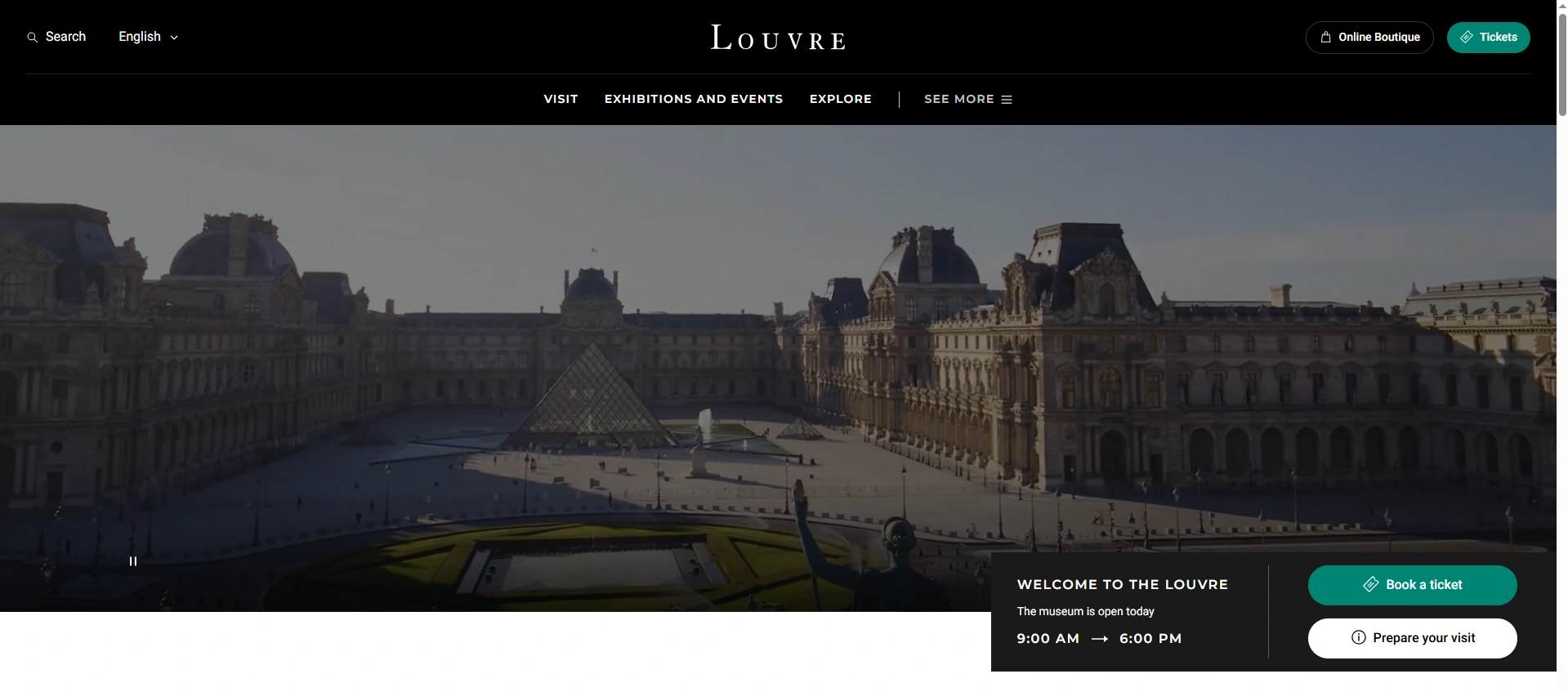
The Louvre’s website (louvre.fr) is a masterclass in balancing gravitas with usability. The homepage opens with a dramatic full-width image of the iconic glass pyramid, immediately establishing visual identity. Navigation is clean and bilingual, serving both French and international audiences.
What they do well:
- Seamless French/English language switching
- Deep collection database with over 480,000 works searchable online
- Dedicated education section with resources for teachers
2. The British Museum, London
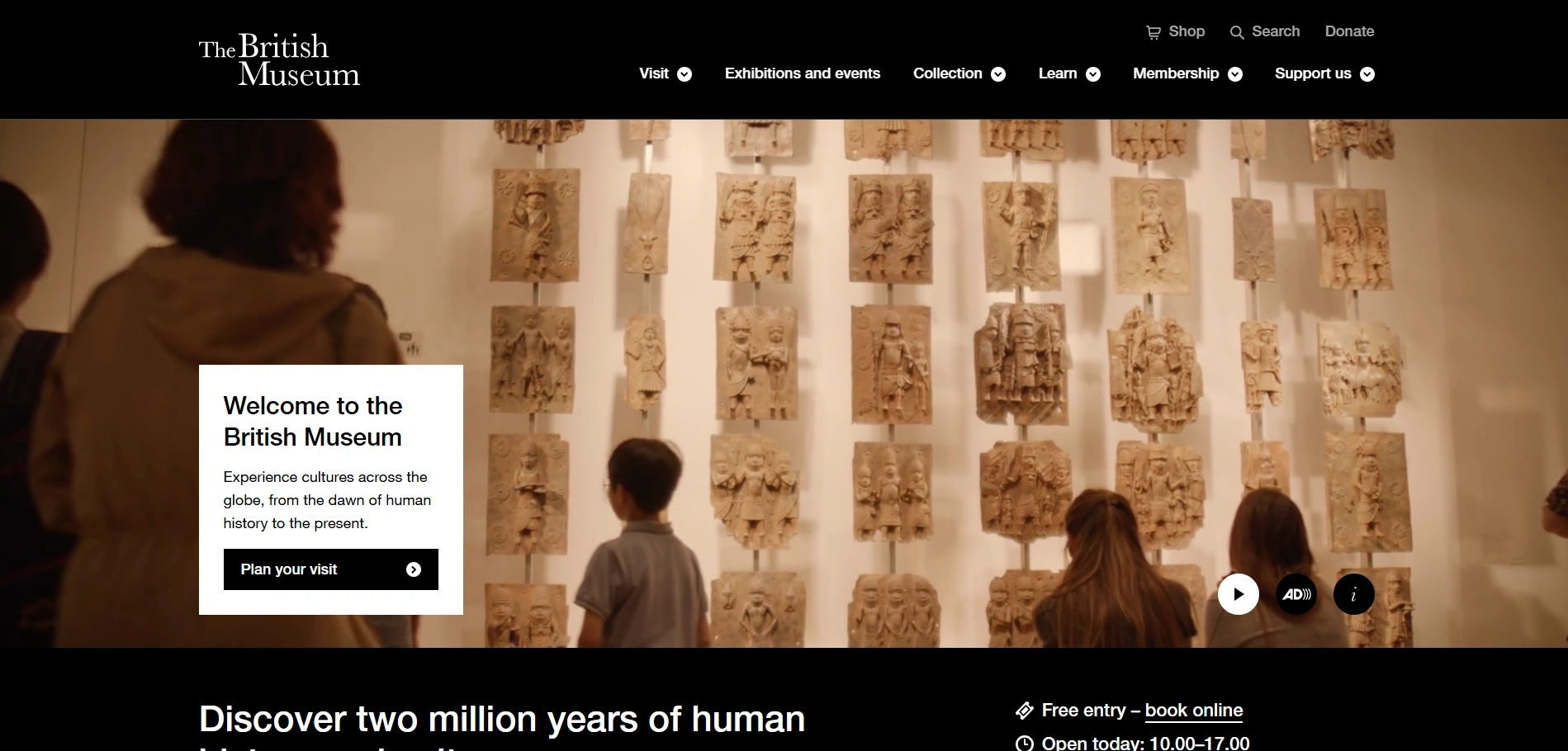
The British Museum’s website excels at website performance optimization – it loads fast despite containing one of the richest collection databases online. Their “Collection Online” search tool lets users explore over 4 million objects, filter by culture, period, and material, and view high-resolution images.
What they do well:
- Powerful, accessible collection search
- Clear exhibition hierarchy on the homepage
- Strong educational resource section for schools
3. MoMA, New York
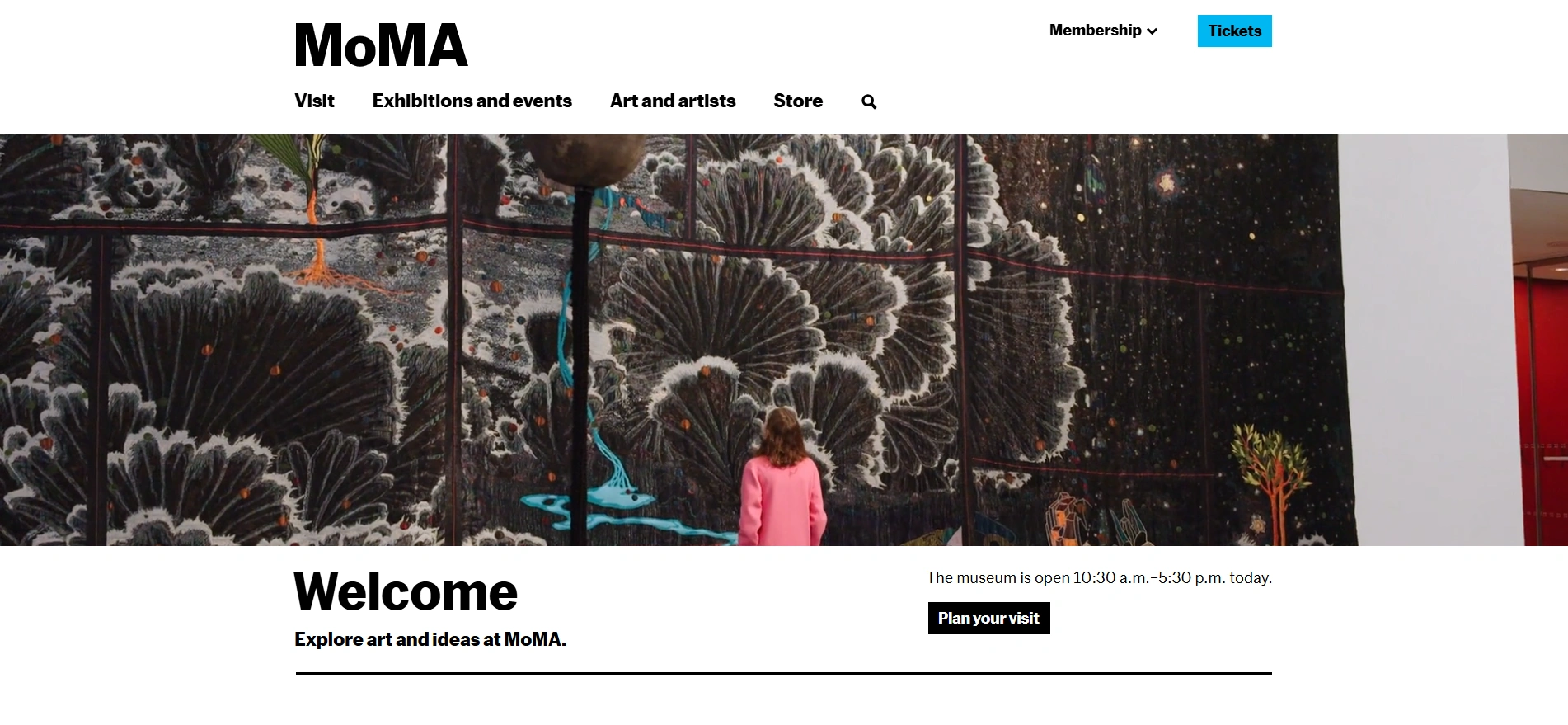
MoMA’s website (moma.org) is arguably the most design-forward of any major museum. As an institution defined by contemporary art, their website reflects that identity – bold, experimental, and visually daring. The team publishes MoMA Magazine content directly on the site, making it a destination in its own right, not just a ticketing gateway.
What they do well:
- Content-rich editorial design that extends the brand
- Online store integrated naturally with collection content
- Excellent mobile experience with fast load times
4. Rijksmuseum, Amsterdam
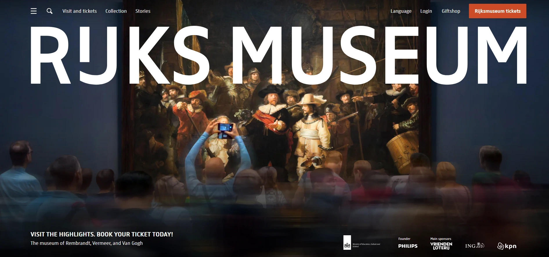
The Rijksmuseum is famous in digital museum circles for a bold strategic decision: they made their entire collection downloadable in high resolution for free. This move generated enormous press, massive SEO lift, and a surge in international visitor numbers.
What they do well:
- “Rijksstudio” – a tools for users to create their own collections from the museum’s works
- Exceptional virtual tour experience
- Clear, multilingual navigation
5. National Gallery, London

The National Gallery’s website demonstrates how to make an enormous collection accessible to non-expert audiences. Their “Discover the paintings” section breaks the collection down by theme, period, and artist – a content structure that serves casual browsers and serious researchers alike.
What they do well:
- Excellent thematic content clustering
- Prominent “Plan Your Visit” section above the fold
- Regular blog content that drives organic search traffic
6. Guggenheim Museum, New York

The Guggenheim’s website is built around the iconic Frank Lloyd Wright building, and their design choices consistently reinforce this architectural heritage. The spiral motif appears subtly across visual elements, and the photography always features the building as much as the art inside it.
What they do well:
- Strong visual identity consistency between physical and digital brand
- Clear global network presentation (Bilbao, Venice, Abu Dhabi)
- Excellent membership pathway with contextual prompts
7. Tate Modern, London

Tate Modern operates four galleries across the UK and their website has to serve all of them without confusion. Their navigation architecture is a genuine achievement – clear location-switching, unified events calendar, and consistent design language across a very complex content ecosystem.
What they do well:
- Multi-site architecture handled with elegance
- “Tate Kids” section demonstrates audience segmentation done right
- Strong online store with artist merchandise and prints
8. Smithsonian National Museum, Washington D.C.
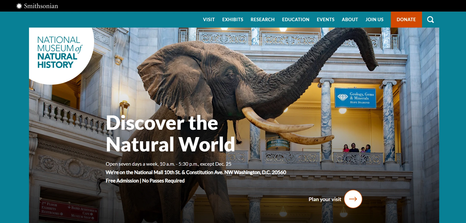
The Smithsonian operates 19 museums and a zoo – and their website has to be the front door to all of them. The Smithsonian’s digital platform is one of the most ambitious in the world, and their SEO friendly website structure is a major reason they dominate search results for countless educational queries.
What they do well:
- Powerful site-wide search across all institutions
- Free admission messaging is prominent (a key differentiator)
- Extensive open access digital collections
9. Van Gogh Museum, Amsterdam

The Van Gogh Museum’s website demonstrates how a single-artist institution can build enormous digital depth. Their “Vincent’s Life” interactive timeline, detailed provenance research, and “Stories” editorial section make this one of the richest museum content experiences online.
What they do well:
- Deep storytelling around a single subject with genuine expertise
- Beautiful integration of Van Gogh’s letter archives
- Clear ticketing with timed-entry slot selection
10. Uffizi Gallery, Florence
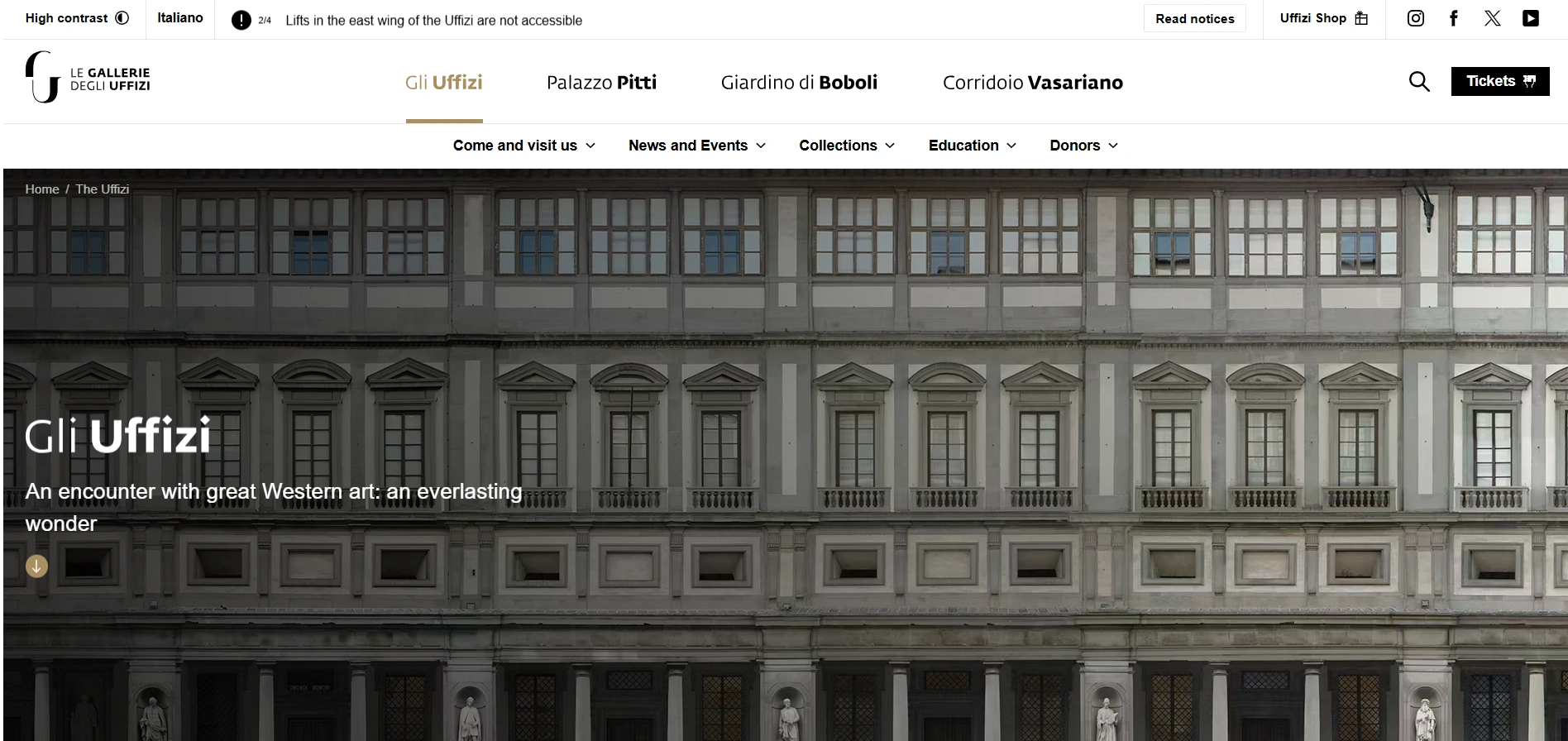
The Uffizi’s website has undergone a significant digital transformation in recent years. The Italian Renaissance masterpiece collection is now accessible via a rich online database, and the site has invested heavily in high-resolution photography that makes remote exploration genuinely satisfying.
What they do well:
- Excellent high-resolution collection photography
- Strong multilingual support across seven languages
- Integrated virtual tour experiences for key works
Why Mandy Web Design is a Great Choice for Your Museum Websites Design
A museum website is more than just an information page-it is a digital space where history, art, and culture come alive. It should be simple to explore, visually engaging, and easy for every visitor to use. Our web designing company creates museum websites that feel modern, informative, and enjoyable from the very first click.
We design websites for museums of all types-art galleries, history museums, cultural centers, and educational institutions. Every project is carefully crafted to match the museum’s identity while ensuring a seamless user experience for visitors of all ages.
Looking to build a museum website that feels simple, modern, and easy to use? We can help you make it happen. Our services include custom web design, WordPress web design, UI/UX design, responsive design, website redesign, landing page design, and eCommerce web design to create a smooth and engaging experience for your visitors.
Frequently Asked Questions
A museum website helps visitors learn about exhibitions, events, and tickets before visiting. It creates a strong first impression and makes information easy to access. A good website also helps museums reach more people and share their collections with a wider online audience.
A good museum website is simple, fast, and easy to navigate. It should have clear menus, strong visuals, mobile-friendly design, and updated information. Visitors should quickly find exhibitions, timings, and booking details without confusion or extra effort.
Good UX helps visitors explore a website without confusion. It improves layout, navigation, and content flow. When users can easily find what they need, they stay longer and engage more with the museum’s content and exhibitions.
Yes, most users browse websites on mobile devices. A mobile-friendly museum website ensures smooth viewing on all screen sizes. It improves readability, navigation, and overall user experience, making it easier for visitors to explore content anywhere.
The time depends on project size and features. A simple museum website may take a few weeks, while advanced websites with booking systems, virtual tours, and custom features can take longer to design and develop properly.
A museum website should include exhibition pages, event updates, online ticket booking, virtual tours, contact details, and gallery sections. These features help visitors easily explore the museum and plan their visit without any difficulty.
Yes, a well-designed website attracts more visitors by making information easy to access. When users can explore exhibitions and book tickets easily online, they are more likely to visit the museum in person.
Mandy Web Design helps museums create simple, modern, and user-friendly websites that improve visitor experience. We focus on clean design, fast performance, and easy navigation so users can explore exhibitions and information without confusion. Our goal is to build websites that truly represent your museum online.

About the Writer
Abhishek Thakur
Sr. Content Writer at Mandy Web Design
Abhishek Thakur is the Senior Content Writer at Mandy Web Design, where he crafts engaging content for the company’s website, blog, and marketing campaigns. With 5+ years of experience in digital marketing and SEO content creation, he specializes in turning complex topics into easy-to-understand, actionable strategies that help businesses grow online. He is passionate about creating high-quality, value-driven content that connects with audiences and builds brand authority. When he’s not writing, he enjoys exploring new ideas, learning the latest marketing trends, and improving his creative skills.