Objective;
This blog helps you understand dark mode websites, including their advantages, disadvantages, and where they work best, so you can choose the right design for your website.
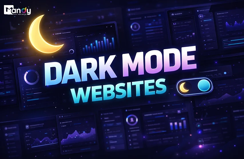
Dark mode websites are becoming very popular today. Many people like dark backgrounds because they look clean and modern. They are also easier to look at, especially at night or in low light.
Did You Know? Around 55% of users say dark mode helps reduce eye strain, especially during long screen usage.
But dark mode is not always the best choice for every website. Sometimes text can be hard to read if the colors are not used properly. It also may not suit all types of content or users.
In this blog, we will look at the pros, cons, and where dark mode works best. This will help you understand if dark mode is a good option for your website.
Upgrade Your Website with Modern Dark Mode Design & Better UX – Starting at Just $10/Hour!
Key Takeaways
- Dark mode gives your website a modern look and feels easier on the eyes in low light.
- It is best for creative and visual websites, not always for text-heavy content.
- If not designed well, it can make text hard to read.
- Choose dark or light mode based on your users and website needs.
Table of Contents
- What Are Dark Mode Websites?
- Why Dark Mode Is Gaining Popularity
- Pros of Dark Mode Websites
- Cons of Dark Mode Websites
- Dark Mode vs Light Mode: Which One Is Better?
- Best Use Cases for Dark Mode Websites
- When You Should Avoid Dark Mode
- Why Choose Mandy Web Design for Modern Website Solutions
- FAQs About Dark Mode Websites
What Are Dark Mode Websites?
A dark mode website uses dark backgrounds — usually deep blacks, dark grays, or navy tones — paired with lighter text and UI elements. Instead of the traditional white or light-colored backgrounds that most websites use, dark mode flips the visual hierarchy so that the interface feels more subdued and immersive.
Dark mode is not a new concept. Operating systems like Windows and macOS have offered dark themes for years. Mobile platforms such as Android and iOS followed suit. Now, websites and web applications are embracing the same shift.
When designers think carefully about design typography and contrast ratios in a dark interface, the result can be a highly polished, premium-looking product. The key is that dark mode requires deliberate design choices — it is not simply about inverting colors. Every shade, border, shadow, and highlight needs to be rethought from the ground up to maintain clarity and usability.
Dark mode websites often use color palettes built around dark neutral bases with vibrant accent colors — electric blues, neon greens, purples, or warm ambers — to create focal points and guide user attention. When done well, the visual result is striking and memorable.
Why Dark Mode Is Gaining Popularity
The rise of dark mode is not just a passing trend. Several real-world factors are driving its growing adoption across the web.
User Preference and Comfort
A large portion of internet users spend hours staring at screens every single day. Eye strain, headaches, and discomfort from bright screens have become common complaints. Dark mode reduces the intensity of light emitted by screens, making prolonged browsing more comfortable — especially in dimly lit environments. Surveys consistently show that a significant percentage of users prefer dark mode for evening and nighttime use.
OLED and AMOLED Screen Technology
Modern smartphones and laptops increasingly use OLED and AMOLED display panels. On these screens, true black pixels are turned off entirely, which means dark mode can actually save battery life. This is a practical, tangible benefit for mobile users — not just a visual preference.
A Shift in the Latest Design Trends
The design trends broadly moved toward dark aesthetics. Tech companies, creative agencies, gaming platforms, and entertainment brands have adopted dark UI to signal sophistication and modernity. When Apple, Google, and Microsoft all embraced dark mode at the system level, it signaled to the broader design community that this was a mainstream, lasting preference — not a niche one.
Accessibility and Reduced Blue Light
While accessibility needs vary from user to user, many people with light sensitivity or certain visual conditions find dark backgrounds significantly more comfortable to read on. Reducing harsh white light — which contains high amounts of blue light — can help users who are sensitive to glare.
Pros of Dark Mode Websites
1. Reduces Eye Strain in Low-Light Environments
One of the most cited benefits of dark mode is how much easier it is on the eyes when browsing at night or in a dark room. Bright white screens in dark rooms force pupils to constantly adjust, causing fatigue. A well-designed dark interface minimizes this contrast between the screen and the surrounding environment, creating a more comfortable experience.
2. Creates a Premium, Modern Visual Aesthetic
Dark backgrounds naturally make colors pop. Vibrant images, neon accents, and glowing UI elements all look more dramatic against a dark canvas. Brands that want to project luxury, innovation, or exclusivity often turn to dark mode because it simply looks and feels more high-end. Understanding the elements of good website design — including contrast, hierarchy, and whitespace — is crucial when building a dark mode interface that genuinely feels premium rather than just dark.
3. Can Improve Battery Life on OLED Screens
As mentioned earlier, OLED and AMOLED displays power off individual pixels when they display black. A website that uses true black backgrounds can contribute meaningfully to battery savings on compatible devices. For websites that attract mobile-heavy audiences, this is a real user experience benefit.
4. Improves Focus on Visual Content
Dark backgrounds push everything except the focal content into the background. For portfolios, photography websites, video platforms, and digital art galleries, dark mode allows images and visuals to command full attention without the distraction of a bright surrounding interface. This is why so many creative platforms — from Behance to YouTube — have embraced dark themes.
5. Feels Immersive for Certain Experiences
Applications and websites that are designed to be immersive — games, streaming services, music platforms — benefit greatly from dark mode. Darkness creates a sense of depth and draws the user into the experience, similar to how a movie theater dims its lights before the show begins.
6. Strong Alignment With Current UI UX Trends
Dark mode is firmly embedded in current design culture. Users who follow tech and design expect top-tier digital products to offer dark themes. Offering dark mode can signal to your audience that your brand is current, thoughtful, and user-focused.
Cons of Dark Mode Websites
1. Readability Challenges With Long-Form Text
While dark mode can look stunning for visual content, it often creates readability issues for text-heavy pages. Pure white text on a pure black background creates a phenomenon called halation — where bright text appears to bleed or glow slightly against the dark background. This can make reading long articles or documents tiring over time. Pure white (#FFFFFF) on pure black (#000000) is actually harder to read than carefully moderated dark gray backgrounds with off-white text.
2. Accessibility Concerns for Certain Users
Dark mode does not work equally well for all users. People with astigmatism, dyslexia, or certain types of color blindness may actually find light mode easier to read. Accessibility is a core part of how you optimize website UI UX for the widest possible audience — and if your user base includes older adults or users with specific visual impairments, a light mode default with an optional dark mode toggle may be more inclusive.
3. Color Accuracy and Brand Consistency Issues
Colors behave differently on dark backgrounds than they do on light ones. Brand colors that look perfect on a white background may appear washed out, neon, or entirely different on dark gray. This creates challenges for businesses where consistent color representation matters — such as e-commerce stores where product colors need to look accurate, or brands with carefully defined visual identities.
4. Harder to Design Well
Dark mode is not simply the inverse of light mode. It demands a complete rethinking of color choices, shadow behavior, typography weight, and contrast ratios. Shadows — which are used extensively in light UI design to create depth — become nearly invisible on dark backgrounds, requiring designers to use glow effects and borders instead. If the website design process does not allocate sufficient time and expertise for dark mode development, the result can look amateurish or difficult to use.
5. Printing and Content Sharing Issues
Dark mode interfaces can create practical issues when users want to print or screenshot content. Dark backgrounds waste printer ink and often produce unreadable printouts. If your website deals with content that users regularly print — such as invoices, reports, or recipes — dark mode can become a friction point.
6. May Not Suit All Industries or Audiences
Dark mode carries strong visual associations. It tends to feel tech-forward, edgy, or sophisticated. These associations are a great fit for gaming companies, creative agencies, or fintech startups. But for hospitals, children’s educational platforms, food blogs, or traditional retail businesses, a dark interface can feel mismatched — even untrustworthy.
Need a Professional Website for Your Business?
Get a custom-designed website that looks great, works smoothly, and helps your business grow with better online visibility and performance!
Dark Mode vs Light Mode: Which One Is Better?
This is one of the most debated questions in modern web design, and the honest answer is: it depends entirely on your audience, your content, and your brand.
When Light Mode Wins
Light mode remains the default standard for good reason. It offers higher readability for long-form text, better color accuracy, broader accessibility coverage, and stronger familiarity for general audiences. If your website contains large amounts of written content, educational material, or serves a diverse age range, light mode is typically the safer and more effective choice.
Light mode also aligns better with standard print conventions — which means users transitioning from reading physical books, newspapers, or documents will feel more at home. It is also worth noting that SEO friendly website structure requires content to be readable and well-structured regardless of visual theme, and light mode typically creates fewer readability-related accessibility issues that could affect search performance.
When Dark Mode Wins
Dark mode wins decisively in environments where visual impact, immersion, and aesthetic appeal are the primary goals. Portfolios, entertainment platforms, creative tools, tech products, and premium lifestyle brands tend to benefit most. Dark mode also wins for users who predominantly browse at night or on OLED mobile devices.
The Best Solution: Give Users the Choice
Many leading websites today offer both options through a simple toggle. This approach respects user autonomy, accommodates different contexts, and signals design maturity. System-level dark mode detection (using CSS prefers-color-scheme) allows websites to automatically match the user’s operating system preference — a feature that has become a near-standard expectation among technically literate users.
Building both modes does increase the time and cost of development. Factoring this into your web design cost planning early in the project will help you avoid budget surprises and ensure both themes receive the attention they deserve.
Best Use Cases for Dark Mode Websites
Not every website benefits equally from dark mode. Here are the scenarios where it genuinely shines.
1. Creative Portfolios and Design Agencies
Dark backgrounds make photography, illustration, video, and graphic design work stand out dramatically. When the interface steps back and lets the creative work command attention, the portfolio feels more impactful. Most top design agencies and creative professionals choose dark mode precisely for this reason.
2. Entertainment and Streaming Platforms
Video content and dark mode are a natural pairing. YouTube, Netflix, and Twitch have all embraced dark UI because it creates a cinema-like experience that keeps the viewer focused on the screen. The lack of bright surrounding interface elements reduces eye fatigue during long viewing sessions.
3. Gaming Websites and Platforms
Gaming is one of the strongest use cases for dark mode. The aesthetic matches the immersive, high-tech nature of gaming culture. Dark backgrounds allow neon accents, dramatic typography, and high-contrast visuals to create the intense energy that gaming audiences expect. A well-executed web design layout for a gaming platform uses dark mode to guide the eye through dense information — game previews, stats, leaderboards — without visual overload.
4. Developer Tools and Coding Platforms
Programmers overwhelmingly prefer dark themes for their code editors, and this preference extends naturally to web-based developer tools, documentation platforms, and SaaS dashboards. GitHub, Vercel, and most modern developer-facing products offer dark mode as a primary option.
5. Music and Audio Platforms
Spotify, SoundCloud, and Apple Music all use dark UI. Music listening is often a nighttime, ambient activity. Dark mode supports that mood and keeps the interface from being distracting while the user is focused on listening.
6. Fintech and Crypto Dashboards
Financial data platforms and cryptocurrency dashboards frequently use dark mode to project a sense of precision, sophistication, and seriousness. Dense data — charts, graphs, numbers — often reads more clearly against dark backgrounds when designed with care.
7. Photography and Art Galleries
For any website where images are the primary product, dark mode is the obvious choice. Black or very dark gray backgrounds act like a gallery wall, giving images room to breathe and drawing the eye directly to the subject matter. Ensuring proper image optimization is especially important here — high-quality, fast-loading images are the heart of the experience, and dark mode amplifies the impact of every visual.
When You Should Avoid Dark Mode
Just as there are ideal use cases for dark mode, there are also contexts where it is better avoided.
E-Commerce Stores
Online shopping relies on accurate color representation, clean product imagery, and a bright, inviting atmosphere. Most successful e-commerce websites design use light mode because it feels more trustworthy, mirrors the experience of browsing a well-lit store, and shows product colors accurately. A dark background can distort the perceived color of clothing, furniture, or beauty products — leading to hesitation and reduced conversions.
Healthcare and Medical Websites
Healthcare websites serve users who are often already anxious or stressed. Clean, white, clinical interfaces signal safety, professionalism, and clarity. Dark mode can feel cold, serious, or even alarming in these contexts. Accessibility also plays a critical role — healthcare websites must be usable by elderly users and people with diverse visual abilities.
Educational Platforms for Children
Children’s learning platforms like schools need bright, warm, and inviting interfaces. Bold colors, playful typography, and cheerful backgrounds create the engaging, approachable environment that young learners respond to best. Dark mode would work directly against this goal.
News and Long-Form Publishing
While a dark mode option is welcome for individual user preference, news websites and blogs that default to dark mode can make extended reading uncomfortable. Long-form content demands carefully optimized typography, line spacing, and contrast — all of which are more naturally suited to light backgrounds. Improving website UX for a news platform means prioritizing readability above visual drama.
Government and Institutional Websites
Trust and accessibility are paramount for government websites. These platforms must meet strict accessibility standards and serve users across every age and ability level. Light mode provides a universally familiar, accessible baseline that dark mode cannot reliably replicate for all users.
Food and Recipe Websites
Food photography looks its best surrounded by warmth and light — think of a magazine spread or a cookbook. Dark backgrounds can make food images look cold or unappetizing. Recipe content is also frequently printed, making a dark UI impractical.
Why Choose Mandy Web Design for Modern Website Solutions
When it comes to creating a website that looks modern and performs well, choosing the right team makes all the difference. Mandy Web Design, top-rated website designing company focuses on building user-friendly and result-driven websites. Whether you want to implement dark mode or improve your overall website design, Our expert team of designers and developers ensures every detail is handled with care.
We offer complete website solutions, including custom design, WordPress design, UI/UX design, website redesign, responsive design, and landing page design. Our approach is simple—understand your business goals and create a website that helps you achieve them. From clean layouts to smooth user experience, we make sure your website stands out in a competitive market.
If you are looking to upgrade your website with modern features like dark mode or want a complete redesign, Mandy Web Design is a reliable partner to help you grow online.
Want a Modern Website with Dark Mode?
Get a stylish, user-friendly website designed to improve experience, boost engagement, and match your brand with expert design solutions!
FAQs About Dark Mode Websites
A dark mode website uses a dark background with light text and design elements. It is designed to reduce screen brightness and make viewing more comfortable, especially in low light. Many modern websites offer dark mode to improve user experience and give a stylish, modern look.
Dark mode can be better for the eyes in low-light environments because it reduces glare and screen brightness. However, in bright light conditions, it may make text harder to read. The comfort level depends on the user’s preference and how well the design is optimized.
Dark mode itself does not directly improve website performance like speed or loading time. However, it can improve user experience, which may increase engagement and reduce bounce rates. On some devices, especially with OLED screens, it can also help save battery life.
Not every website needs dark mode. It depends on the type of content, target audience, and purpose of the website. For example, creative and tech websites benefit more from dark mode, while content-heavy or educational websites may perform better with light mode.
The main disadvantages include readability issues, poor contrast if not designed properly, and difficulty displaying certain colors. It may also not suit all users or industries. Creating a proper dark mode design requires extra effort, testing, and careful planning to ensure a good user experience.
Dark mode does not directly affect SEO rankings. Search engines focus on content, speed, and structure rather than color themes. However, a better user experience through dark mode can indirectly help improve engagement, which may positively impact your website’s overall SEO performance.
You can add dark mode by using CSS, JavaScript, or website frameworks that support theme switching. It is important to design both light and dark versions carefully. Testing readability, contrast, and usability is essential to make sure users have a smooth experience.
Industries like technology, gaming, entertainment, design, and photography benefit the most from dark mode websites. These industries rely heavily on visuals and modern design. Dark mode helps highlight content, improve user engagement, and create a premium and immersive browsing experience.

About the Writer
Abhishek Thakur
Sr. Content Writer at Mandy Web Design
Abhishek Thakur is the Senior Content Writer at Mandy Web Design, where he crafts engaging content for the company’s website, blog, and marketing campaigns. With 5+ years of experience in digital marketing and SEO content creation, he specializes in turning complex topics into easy-to-understand, actionable strategies that help businesses grow online. He is passionate about creating high-quality, value-driven content that connects with audiences and builds brand authority. When he’s not writing, he enjoys exploring new ideas, learning the latest marketing trends, and improving his creative skills.