Objective;
To help beginners and web professionals understand the three types of CSS, inline, internal, and external, and learn when and how to use each method for building better, faster, and well-structured websites.
CSS is one of the most important parts of web design. It helps make websites look clean, attractive, and easy to use. From changing colors and fonts to arranging page layouts, CSS gives websites their visual style and improves the overall user experience.
According to W3Techs data from June 2026, inline CSS is used by 94.4% of all websites that use CSS, external CSS by 93.2%, and embedded (internal) CSS by 85.0%. This confirms that all three types remain relevant and are actively used by developers worldwide.
There are different ways to add CSS to a website, and each method works in a different way. Some styles can be added directly to an element, while others can be applied to an entire page or multiple pages at once. Understanding these methods makes website development easier and more organized.
In this blog, we will explain the three main types of CSS: Inline CSS, Internal CSS, and External CSS. You will learn what each type is, how it works, and when to use it while building or managing a website.
Key Takeaways
- Inline CSS applies styles to a single HTML element and has the highest specificity but is hard to maintain at scale.
- Internal CSS styles one page using a style block and works best for single pages or prototypes.
- External CSS is the industry standard for multi-page websites, supports browser caching, and improves speed and maintainability.
- CSS specificity determines which rule wins when multiple styles conflict, with inline CSS always taking priority over internal and external.
- Modern CSS best practices like minification, removing unused styles, using CSS variables, and responsive design directly improve website performance and Core Web Vitals scores.
Table of Contents
- What Is CSS and Why Is It Important?
- What Are the Different Types of CSS?
- Inline CSS Explained
- Internal CSS Explained
- External CSS Explained
- Key Differences Between Inline, Internal, and External CSS
- CSS Priority and Specificity
- Choosing the Right Type of CSS for Your Project
- Modern CSS Best Practices
- Why Mandy Web Design Is the Right Partner to Build Your CSS-Powered Website
- Frequently Asked Questions
What Is CSS and Why Is It Important?
CSS stands for Cascading Style Sheets. It is a stylesheet language used to describe how HTML elements should appear on a screen. While HTML builds the structure of a webpage, CSS handles the visual presentation. Think of HTML as the skeleton of a website and CSS as the clothing and appearance.
Without CSS, every webpage would look like a plain text document with no color, no layout, and no visual hierarchy. CSS is what transforms raw HTML into a polished, professional-looking website.
According to the Web Almanac 2023 report by HTTP Archive, over 98% of all websites on the internet use CSS. This number alone shows how critical CSS is in modern web development. It is not optional. It is essential.
CSS controls a wide range of visual properties including:
- Font size, style, and color
- Background colors and images
- Page layout and spacing
- Responsive design for mobile devices
- Animations and transitions
- Button styles and hover effects
Beyond aesthetics, CSS also plays a role in website performance optimization. A well-structured stylesheet reduces page load time, improves rendering speed, and contributes positively to user experience metrics. Poor CSS management, on the other hand, can bloat a page and slow it down considerably.
CSS also directly impacts accessibility. Proper use of CSS ensures that websites are readable, navigable, and usable for people with disabilities. Color contrast, font legibility, and responsive layouts all depend on thoughtful CSS implementation.
In short, CSS is not just about making a website look good. It is about making it work well for every user on every device.
What Are the Different Types of CSS?
CSS can be applied to a webpage in three distinct ways. Each method has a different scope, a different use case, and a different impact on how styles are managed across a website.
The three types of CSS are:
- Inline CSS – Applied directly to individual HTML elements using the style attribute
- Internal CSS – Written inside a style tag within the HTML document’s head section
- External CSS – Stored in a separate .css file and linked to the HTML document
Each type has its own strengths and weaknesses. Choosing the right one depends on the size of your project, the level of consistency you need, and how maintainable you want your code to be.
Understanding the differences between these three types is a core part of the website development process. When developers know which CSS method to use and when, they can build websites that are faster, cleaner, and easier to scale.
Let us explore each type in detail.
Inline CSS Explained
What Is Inline CSS?
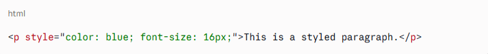
Inline CSS is the method of applying styles directly to a single HTML element using the style attribute. The styles are written inside the opening tag of the element itself.
Syntax Example
What Is Inline CSS?
Inline CSS is the method of applying styles directly to a single HTML element using the style attribute. The styles are written inside the opening tag of the element itself.
Syntax Example
In this example, only this specific paragraph will have blue text and a 16px font size. No other paragraph on the page will be affected.
How Inline CSS Works
Inline CSS applies styles at the element level. Because the style is written directly in the HTML tag, it only affects that one specific element. It does not cascade to other elements or pages.
Inline CSS has the highest specificity in CSS priority rules. This means it will override both internal and external styles applied to the same element. We will cover CSS specificity in more detail later in this article.
When to Use Inline CSS
Inline CSS is useful in specific scenarios:
- Quick fixes or one-off edits: If you need to change the style of just one element temporarily, inline CSS is the fastest option.
- HTML email templates: Email clients often strip external stylesheets, so inline CSS is frequently used in email design.
- Dynamic styles via JavaScript: When JavaScript needs to change the appearance of an element on the fly, inline styles are commonly applied programmatically.
- CMS overrides: In platforms like WordPress, inline styles are sometimes used to override theme defaults for a specific block or element.
Limitations of Inline CSS
Despite its convenience, inline CSS has significant drawbacks:
- It is not reusable. You have to repeat the same styles for every element.
- It clutters your HTML code, making it harder to read and maintain.
- It is very difficult to manage on large websites.
- It mixes content and presentation, which goes against best practices in modern development.
- It can negatively affect SEO because search engines prefer clean, well-structured HTML.
Expert Insight: According to Google’s developer documentation, keeping HTML clean and separating presentation from content helps crawlers better understand page structure, which can improve indexing.
Internal CSS Explained
What Is Internal CSS?
Internal CSS, also called embedded CSS, is written inside a <style> tag placed within the <head> section of an HTML document. Unlike inline CSS, internal CSS can style multiple elements on the same page using selectors.
Syntax Example
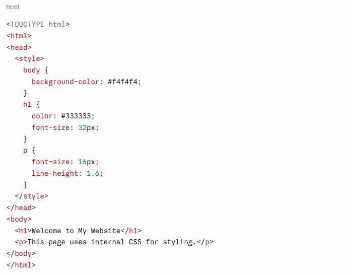
All h1 and p elements on this page will follow the rules defined in the style block.
How Internal CSS Works
Internal CSS applies styles page-by-page. Every rule you write in the style block will apply to all matching elements on that specific page. If you have 10 pages, you would need to copy the same style block across all 10 pages to maintain consistency, which is one of its main weaknesses.
When to Use Internal CSS
Internal CSS is appropriate in these situations:
- Single-page websites or landing pages: If there is only one page to style, internal CSS is a clean and efficient option.
- Prototyping and testing: Developers often use internal CSS when testing new styles before moving them to an external stylesheet.
- Unique page-specific styles: If one page needs styling that no other page uses, internal CSS avoids unnecessary bloat in the external stylesheet.
- Email templates with head section support: Some email clients support head styles, making internal CSS a better option than inline for complex email layouts.
Limitations of Internal CSS
- Styles only apply to one page. Other pages must have their own style blocks.
- Duplicating styles across multiple pages creates inconsistency and increases maintenance effort.
- It increases HTML file size, which can impact page load time on slow connections.
- Managing large-scale styling across a multi-page site becomes very difficult with internal CSS alone.
External CSS Explained
What Is External CSS?
External CSS is a separate file with a .css extension that contains all the styling rules for a website. This file is linked to one or more HTML documents using the <link> tag in the head section.
Syntax Example
style.css
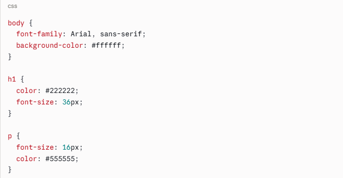
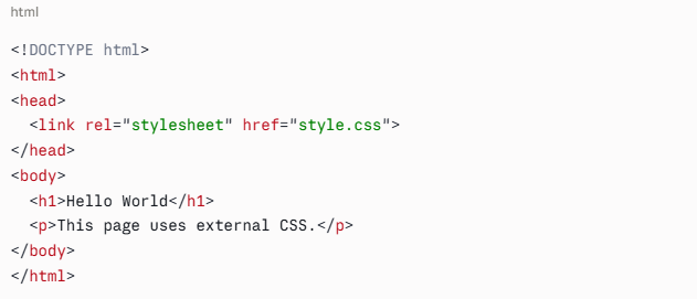
Every page that links to style.css will automatically receive all the styles defined in that file.
How External CSS Works
External CSS separates styling completely from HTML structure. One CSS file can control the appearance of an entire website. When you change a rule in the CSS file, the change is reflected across every page that links to it. This is the foundation of scalable, maintainable web design.
Browsers also cache external CSS files. This means that after a user visits one page, the CSS file is stored in their browser. Every subsequent page they visit loads faster because the browser does not have to re-download the stylesheet. This directly supports improved website speed goals and is one reason external CSS is the preferred method for production websites.
When to Use External CSS
External CSS is the best choice for:
- Multi-page websites: Consistent design across all pages with a single file.
- Large-scale web projects: Enterprise sites, e-commerce platforms, and web applications.
- Team environments: Multiple developers can work on the same CSS file or modular CSS files with a clear structure.
- Performance-focused projects: Browser caching of CSS files reduces load times and supports core web vitals metrics like First Contentful Paint (FCP) and Largest Contentful Paint (LCP).
- Long-term maintainability: One change in one file updates the entire site.
Limitations of External CSS
- Requires an extra HTTP request on the first page load.
- If the CSS file fails to load, the page will display without styles.
- Beginners may find it slightly more complex to set up compared to inline or internal CSS.
Despite these minor limitations, external CSS is the industry standard for web development and the method recommended by most web professionals and frameworks.
Key Differences Between Inline, Internal, and External CSS
Here is a clear comparison of the three CSS types across the most important factors:
Feature | Inline CSS | Internal CSS | External CSS |
Location | Inside HTML element tag | Inside head tag of HTML file | Separate .css file |
Scope | Single element | Single page | Entire website |
Reusability | None | Page-level only | Full reusability |
Maintainability | Very low | Medium | High |
Performance | No caching benefit | No caching benefit | Browser caching supported |
Best Use Case | Quick fixes, emails | Single pages, prototypes | Multi-page websites |
Code Cleanliness | Poor | Moderate | Excellent |
Specificity Priority | Highest | Medium | Lowest |
This table makes it clear why external CSS dominates professional web development. It is the only method that scales efficiently across large projects.
CSS Priority and Specificity
Understanding how CSS handles conflicting rules is essential for writing clean, predictable styles. CSS uses a specificity system to determine which rule wins when multiple styles target the same element.
The priority order from highest to lowest is:
- Inline CSS (highest specificity)
- Internal CSS
- External CSS
- Browser default styles (lowest specificity)
This means that if you apply a red color to a paragraph using external CSS, then override it with blue using internal CSS, and then override it again with green using inline CSS, the paragraph will appear green.
The !important Rule
CSS also has a !important declaration that overrides all other rules, including inline styles. For example:
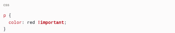
This will force all paragraphs to be red, even if an inline style says otherwise. However, using !important extensively is considered bad practice because it makes stylesheets harder to debug and maintain.
Specificity Calculation
CSS specificity is calculated based on the types of selectors used:
- ID selectors (#header) have the highest specificity among selectors
- Class selectors (.button) and attribute selectors have medium specificity
- Element selectors (p, h1) have the lowest specificity
Understanding specificity prevents one of the most frustrating experiences in CSS: writing a style rule that seems correct but does not apply because another rule is overriding it.
Choosing the Right Type of CSS for Your Project
Now that you understand each type, how do you decide which one to use? Here is a practical guide:
Use Inline CSS When:
- You need a one-time style change on a single element
- You are building HTML email campaigns
- JavaScript is dynamically changing element styles
- You are overriding a very specific style in a CMS environment
Use Internal CSS When:
- You are building a single-page website or landing page
- You are prototyping or experimenting with new designs
- You need unique styles for one page that do not belong in the global stylesheet
- You are working in an environment where external files are not supported
Use External CSS When:
- You are building any website with more than one page
- You want consistent design across all pages
- You are working in a team or on a long-term project
- You care about load times and website health metrics
- You want clean, maintainable, scalable code
Modern CSS Best Practices
CSS has evolved significantly over the past decade. Modern best practices go far beyond simply choosing between inline, internal, and external CSS. Here are the current standards that align with web development trends:
1. Use CSS Custom Properties (Variables)
CSS variables allow you to define reusable values across your stylesheet:
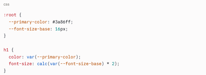
This makes theming and large-scale changes dramatically easier.
2. Adopt a CSS Methodology
Popular methodologies like BEM (Block Element Modifier), SMACSS, or OOCSS help organize CSS at scale. These naming conventions reduce conflicts and improve code readability across teams.
3. Use CSS Preprocessors
Tools like Sass and LESS allow you to write more powerful CSS with features like nesting, mixins, and functions. The preprocessor compiles your code into standard CSS that browsers can read.
4. Minimize and Compress Your CSS
For production websites, always minify your CSS files. Minification removes unnecessary whitespace and comments, reducing file size. A smaller CSS file loads faster and directly contributes to website performance optimization.
According to a 2023 study by Cloudflare, minifying CSS and JavaScript files can reduce total page weight by 10 to 30%, which can meaningfully improve load times, especially on mobile devices.
5. Avoid Unused CSS
Unused CSS rules add weight to your stylesheet without providing any value. Tools like PurgeCSS and Chrome DevTools Coverage can identify and remove unused styles. Removing unused CSS is one of the most effective ways to reduce render-blocking resources and improve Core Web Vitals scores.
6. Implement Critical CSS
Critical CSS refers to the styles needed to render the above-the-fold content of a page. Loading critical CSS inline and deferring the rest improves perceived performance, which positively impacts user experience and SEO.
7. Organize Your External CSS Files
For large projects, use a modular structure. Break your stylesheet into logical files such as:
- reset.css or normalize.css
- typography.css
- layout.css
- components.css
- utilities.css
Then import them in a main style.css file. This approach, often used with CSS preprocessors or modern CSS bundlers, keeps large codebases manageable.
8. Responsive Design First
Always write CSS with responsiveness in mind. Mobile-first design using media queries ensures your website looks great on all screen sizes. Given that over 60% of global web traffic now comes from mobile devices (Statista, 2024), mobile-first CSS is not optional. It is a baseline requirement.
9. Follow Accessibility Guidelines
Use sufficient color contrast ratios (minimum 4.5:1 for normal text per WCAG 2.1), avoid using CSS alone to convey information, and ensure interactive elements have visible focus styles. Accessible CSS benefits all users and is increasingly a legal requirement in many regions.
10. Test Across Browsers
CSS rendering can differ slightly between browsers. Use tools like BrowserStack or the Can I Use database to check compatibility for newer CSS features before deploying to production.
Why Mandy Web Design Is the Right Partner to Build Your CSS-Powered Website
Understanding CSS types is just one piece of the puzzle. Knowing which method to use, how to combine them efficiently, and how to build a complete, high-performing website requires experience, technical expertise, and a team that genuinely cares about your results. That is exactly what Mandy Web Design delivers.
Mandy Web Design is a full-service web design and development company, trusted by over 6,000 businesses across 30+ countries. With more than 15 years of hands-on experience, the agency has earned recognition from some of the most respected names in the industry, including Forbes India, Clutch, Design Rush, G2, and The Hindu.
Whether you are a startup looking for your first professional website or a growing enterprise ready to scale, we have the team and the track record to get you there.
Every website we build is grounded in the same CSS principles covered in this blog. External stylesheets are used for consistency and scalability across all pages. Internal CSS is applied strategically for page-specific needs. Clean, minimal inline styles are used only where necessary, such as for dynamic elements or email templates. The result is always a well-structured, fast-loading, and maintainable codebase.
eady to put everything you have learned about CSS to work on a real website?
Frequently Asked Questions
Inline CSS applies styles to a single element directly in the HTML tag. Internal CSS styles one full page using a style block in the head section. External CSS is a separate file that controls styles across an entire website for consistency and easier management.
External CSS is the best choice for large websites. It stores all styles in one separate file, keeps HTML clean, allows browser caching for faster load times, and makes global design changes easy by editing just one file instead of updating every page individually.
Inline CSS does not benefit from browser caching, which can slightly impact page performance when overused. It also increases HTML file size. For better speed and Core Web Vitals scores, external CSS with minification and critical CSS loading is always the recommended approach for production websites.
Yes, absolutely. Most professional websites use all three types together. External CSS handles global styles, internal CSS manages page-specific rules, and inline CSS is used for dynamic or one-time element changes. Understanding CSS specificity helps avoid conflicts when multiple types target the same element.
External CSS keeps your HTML clean and lightweight, making it easier for search engine crawlers to read and index your page content. It also supports faster load times through browser caching, which positively impacts Core Web Vitals scores and overall search engine ranking performance.
Use internal CSS when you are building a single-page website, a standalone landing page, or when testing new styles before moving them to a global stylesheet. It is also useful when a specific page needs unique styles that do not apply anywhere else on the website.
CSS uses a specificity system to resolve conflicts. Inline CSS has the highest priority and overrides both internal and external styles. Internal CSS overrides external CSS. If two rules have equal specificity, the one written last in the code takes effect. The !important rule overrides everything.
Yes, CSS is essential for building mobile-friendly websites. Using media queries in external CSS allows developers to apply different styles for different screen sizes. A responsive, mobile-first CSS approach improves user experience, reduces bounce rates, and meets Google’s mobile usability standards for better search rankings.

About the Writer
Abhishek Thakur
Sr. Content Writer at Mandy Web Design
Abhishek Thakur is the Senior Content Writer at Mandy Web Design, where he crafts engaging content for the company’s website, blog, and marketing campaigns. With 5+ years of experience in digital marketing and SEO content creation, he specializes in turning complex topics into easy-to-understand, actionable strategies that help businesses grow online. He is passionate about creating high-quality, value-driven content that connects with audiences and builds brand authority. When he’s not writing, he enjoys exploring new ideas, learning the latest marketing trends, and improving his creative skills.