Objective;
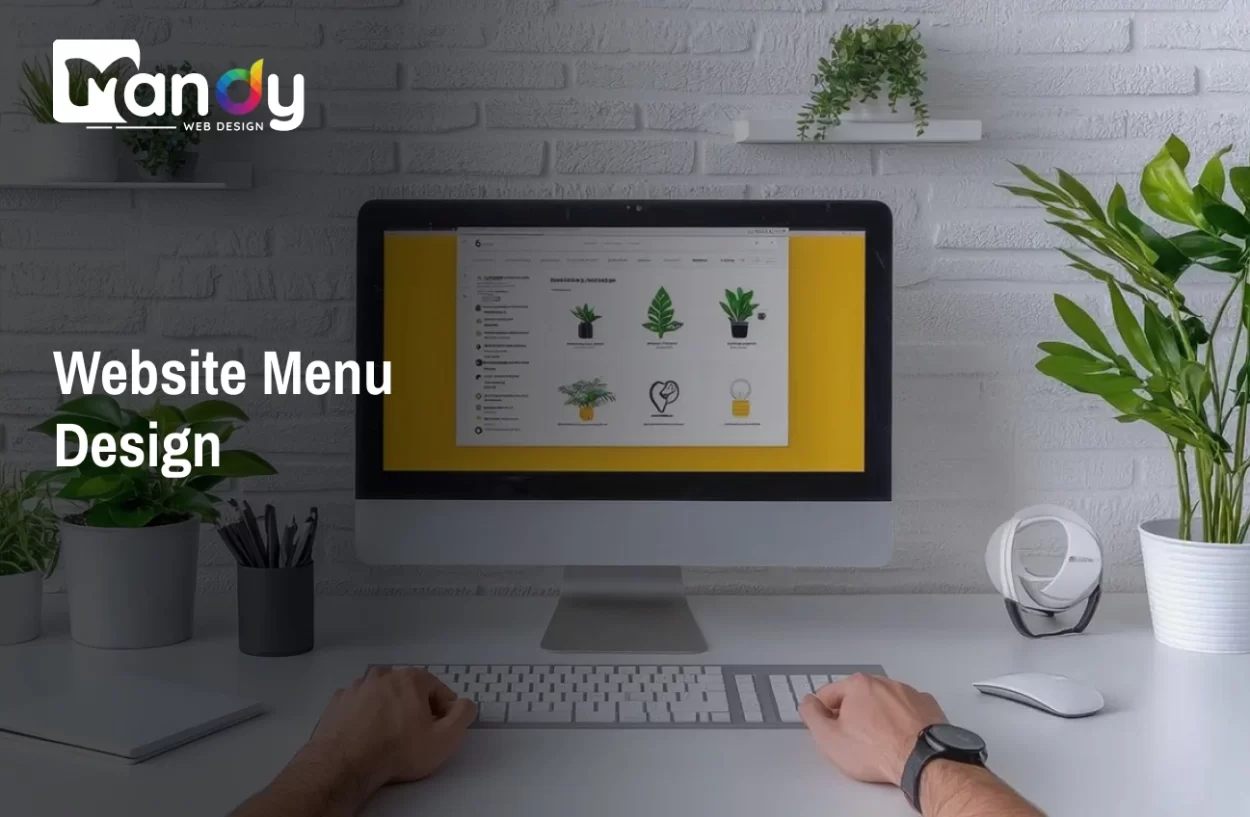
This blog aims to explain website menu design in a simple way, covering its importance, types, and smart strategies using AI and UX trends to create easy, user-friendly, and effective website navigation.
Website menu design is important for helping users move around your site easily. A simple and clear menu makes it easy for visitors to find what they are looking for without any confusion. This also keeps users on your website for a longer time.
A well-designed website menu has a major impact on user behavior. Studies show that 94% of users say easy navigation is the most important website feature, and 37% of users leave a website due to poor navigation experience.
Today, new ideas and trends are changing how menus are designed. With the help of AI, websites can show better and more useful menu options to users. This makes the browsing experience smoother and more helpful.
In this blog, we will share easy tips to improve your website menu design using AI and modern trends. You will learn how to create a menu that is simple, smart, and user-friendly.
Create a Smart & User-Friendly Website Menu with Mandy Web Design – Starting from $10/Hour!
Key Takeaways
- A simple and clear website menu design helps users navigate easily and improves overall user experience.
- A well-structured menu supports SEO by helping search engines understand your website content better.
- Using AI and modern UX trends can make your menu smarter, more personalized, and user-friendly.
- Choosing the right menu type and strategy helps increase engagement, reduce bounce rate, and drive better results.
Table of Contents
- What is Website Menu Design?
- Why Website Menu Design is Important for UX and SEO
- Types of Website Menus You Should Know
- Key Elements of an Effective Website Menu Design
- Smart Website Menu Design Strategies
- Role of AI in Modern Website Menu Design
- Latest UX Trends in Website Menu Design (2026)
- Tools and Technologies for Menu Design
- Why Choose Mandy Web Design for Smart Website Menu Design?
- FAQs About Website Menu Design
What is Website Menu Design?
Website menu design refers to the process of planning, organizing, and styling the navigation elements on a website. It includes deciding how links are arranged, how they look, and how users interact with them. A well-designed menu acts as a roadmap for your website, guiding visitors from one page to another in the most natural and efficient way possible.
In simple terms, your website menu is the set of links or buttons that appear on your site, usually at the top, side, or bottom of the page. These links help users jump to different sections like the homepage, services, blog, contact page, and more.
A good website menu is not just about placing links. It is about creating a system that feels intuitive. Users should never have to think hard about where to click next. The moment your visitor feels lost or confused, they are likely to leave your website.
Good menu design also plays a big role in your overall website design process, as it sets the foundation for how users experience every part of your site. From the labels you choose to the colors you use, every detail in your menu communicates something to your visitors.
Why Website Menu Design is Important for UX and SEO
Many website owners focus on the homepage banner or the content on their pages, but they often overlook the menu. The truth is, your navigation menu directly impacts both user experience and search engine rankings.
Impact on User Experience
When users visit your site, the first thing they look for is a way to navigate. If your menu is confusing, overloaded with options, or hard to find, users will leave quickly. A clean, well-organized menu keeps people on your site longer and encourages them to explore more pages.
To truly improve website UX, your menu needs to be clear, fast, and accessible. Users should be able to find any page within two or three clicks. This is called the “three-click rule,” and it is a fundamental principle of good navigation design.
Impact on SEO
Your website menu also affects how search engines crawl and index your website. When search engines like Google visit your site, they follow the links in your navigation to discover pages. If your menu is well-structured and links to your most important pages, Google will understand your site’s hierarchy better.
This is a key part of building a SEO friendly website structure. A flat and logical menu structure ensures that every important page is easy for search engines to find, which can directly improve your rankings in search results.
A poor menu structure can cause certain pages to be buried deep within your site, making them hard to find for both users and search engines. This hurts your visibility and traffic in the long run.
Types of Website Menus You Should Know
Before designing your menu, it helps to understand the different types available. Each type works best for a specific kind of website or content structure.
1. Horizontal Navigation Menu
This is the most common type of menu, usually placed at the top of a webpage. It works well for websites with a limited number of main pages, such as small business websites or portfolios.
2. Vertical Sidebar Menu
A vertical menu appears on the left or right side of the page. This type is commonly used in dashboards, admin panels, and content-heavy websites where users need to access many sections quickly.
3. Hamburger Menu
The hamburger menu is a small icon, usually three horizontal lines, that expands into a full menu when clicked. It is widely used on mobile devices to save screen space. As the demand for a mobile responsive website has grown, the hamburger menu has become a staple in modern web design.
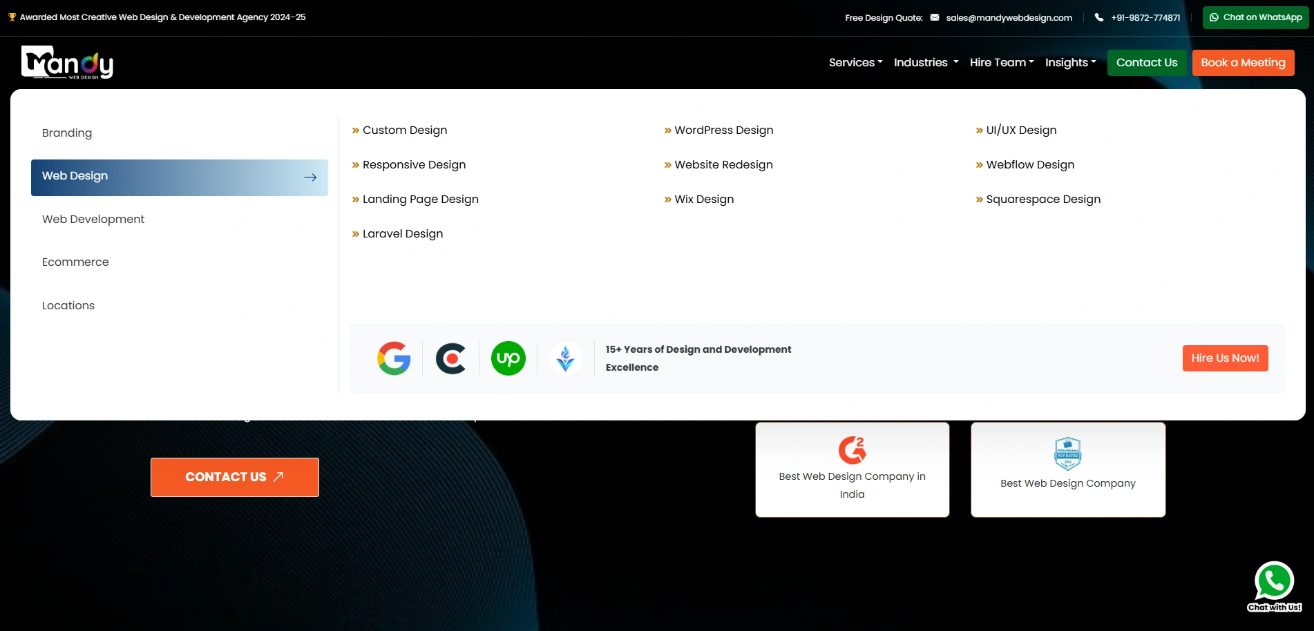
4. Mega Menu
A mega menu is a large dropdown that shows multiple columns of links, sometimes with images and icons. It is best suited for e-commerce websites, large enterprises, or any site with many categories and subcategories.
5. Sticky or Fixed Menu

A sticky menu stays at the top of the screen even when the user scrolls down the page. This keeps navigation always accessible and reduces the need for users to scroll back up to find the menu.
6. Footer Menu
The footer menu sits at the bottom of the page and usually contains secondary links like privacy policy, terms of service, and contact information. While not the primary navigation, it plays an important supporting role.
Key Elements of an Effective Website Menu Design
A great menu is built on several core principles. Understanding the element of good website design will help you build a menu that performs well both for users and for SEO.
Clear and Simple Labels
Every link in your menu should have a label that is easy to understand. Avoid using jargon or clever phrases that might confuse first-time visitors. Words like “Home,” “About,” “Services,” and “Contact” are universally understood and set clear expectations.
Logical Hierarchy
Your menu should reflect the structure of your website. Group related pages together and use dropdown menus to organize subcategories. This makes it easy for users to understand where they are and where they can go next.
Visual Design and Typography
The way your menu looks matters just as much as what it says. Good design typography ensures that your menu text is legible, properly spaced, and visually consistent with the rest of your site. Choose fonts that are clean and easy to read across all screen sizes.
Color and Contrast
Your menu’s color palettes should align with your brand identity while ensuring enough contrast between the background and text. A low-contrast menu is hard to read and can frustrate users. Use hover effects and active states to give users clear visual feedback when they interact with your menu.
Accessibility
A well-designed menu should be accessible to all users, including those using screen readers or keyboard navigation. This means proper use of HTML tags, ARIA labels, and logical tab order. Accessibility is not just a good practice — it is increasingly a legal requirement in many countries.
Want a Better Website Menu Design?
Let’s create a simple, smart, and user-friendly menu that improves navigation and boosts engagement!
Smart Website Menu Design Strategies
Now that you understand the basics, let us look at some smart strategies that can take your menu design to the next level.
1. Keep It Simple and Focused
Less is more when it comes to navigation. Aim to have no more than seven top-level menu items. If you have more content to organize, use dropdowns or mega menus. Overloading your menu with too many links creates decision fatigue for users and dilutes the focus of your navigation.
2. Prioritize the Most Important Pages
Not all pages are equal. Place your highest-value pages, such as your services, portfolio, or contact page, in the most visible spots in your menu. These are the pages that drive conversions and should be easy to find.
3. Use Visual Hierarchy
Use size, weight, and color to draw attention to the most important items in your menu. For example, a “Get a Quote” or “Book Now” button can be styled differently from regular menu links to make it stand out and encourage clicks.
4. Test with Real Users
One of the smartest strategies is to test your menu with real users. Run A/B tests on different menu layouts and track how users interact with them. Heatmaps and session recordings can reveal which menu items are clicked most, which are ignored, and where users get confused. To optimize website UI UX, testing and iteration are essential steps that should never be skipped.
5. Align Menu Design with Overall Layout
Your menu does not exist in isolation. It is part of your overall web design layout, and it should feel consistent with the rest of your page design. The spacing, alignment, and color of your menu should complement your site’s overall aesthetic.
Role of AI in Modern Website Menu Design
Artificial Intelligence is transforming nearly every aspect of digital design, and website menus are no exception. AI-powered tools are helping designers and businesses create smarter, more personalized navigation experiences.
Personalized Navigation
AI can analyze user behavior, browsing history, and preferences to show a personalized menu to each visitor. For example, a returning user who frequently visits your pricing page might see a shortcut to it in their navigation. This level of personalization improves engagement and makes the experience feel tailored.
Predictive Navigation
AI can predict what a user is likely to look for next based on their current behavior. Instead of waiting for a user to search or click through multiple pages, predictive navigation surfaces relevant links before the user even asks. This reduces the number of steps needed to reach a destination.
AI-Powered Search in Menus
Many modern websites are integrating AI-powered search bars directly into their menus. These search tools understand natural language queries and can return highly relevant results instantly. This is especially useful for large websites with hundreds of pages.
Automated Menu Testing
AI tools can also automate the process of testing menu designs. By simulating user behavior across thousands of scenarios, these tools can identify weaknesses in your navigation structure and suggest improvements faster than manual testing.
Chatbot-Enhanced Navigation
AI-driven chatbots are now being embedded in website menus to help users find content through conversation. Instead of clicking through a dropdown, a user can simply type or speak their query and the chatbot guides them to the right page. This is a growing trend, especially for customer service and e-commerce websites.
The use of AI in menu design is one of the most exciting developments in the field. Working with the top web design companies means you can leverage these AI capabilities to build menus that are truly intelligent and adaptive.
Latest UX Trends in Website Menu Design (2026)
The world of web design evolves quickly. Staying current with the latest UI/UX trends is essential if you want to deliver a modern and competitive user experience.
1. Minimalist Navigation
The trend toward minimalism continues to grow. Designers are stripping menus down to their bare essentials, using white space generously and limiting the number of visible options. This creates a cleaner, calmer experience that reduces cognitive overload.
2. Gesture-Based Navigation
With the rise of touch devices, gesture-based navigation is becoming more common. Swipe gestures, pull-down menus, and pinch-to-expand interactions are being incorporated into mobile menus to create a more natural and engaging experience.
3. Dark Mode Menus
Dark mode is no longer just a trend — it has become an expectation. Many users prefer browsing in dark mode, and websites are adapting by offering dark menu themes that are stylish and easy on the eyes.
4. Animated and Micro-Interaction Menus
Subtle animations, hover effects, and micro-interactions are being used to bring menus to life. When a user hovers over a menu item and sees a smooth color transition or a small icon animate, it creates a sense of delight and polish. These small details contribute significantly to overall UX quality.
5. Voice-Activated Navigation
As voice search becomes more prevalent, some websites are experimenting with voice-activated menu navigation. Users can say a command like “Go to the contact page” and the website responds accordingly. While still emerging, this trend is expected to gain momentum as voice technology improves.
6. Scroll-Triggered Menus
Some modern websites use scroll behavior to trigger changes in the navigation menu. For example, the menu might be transparent at the top of the page and become solid white with a drop shadow when the user scrolls down. This keeps the design elegant without sacrificing usability.
Tools and Technologies for Menu Design
Having the right tools makes menu design much easier and more effective. Here are some of the most popular tools used by designers today.
1. Figma
Figma is the leading design tool for creating website prototypes and mockups. It allows designers to build interactive menu prototypes that can be tested with real users before any code is written. Its collaborative features make it ideal for teams.
2. Adobe XD
Adobe XD is another powerful tool for designing and prototyping website navigation. It integrates well with other Adobe products and offers excellent features for creating interactive menu flows.
3. Webflow
Webflow allows designers to build fully functional, custom menus without writing code. It supports animations, sticky menus, hamburger menus, and more, all within a visual interface.
4. WordPress and Page Builders
For WordPress-based websites, page builders like Elementor and Divi offer drag-and-drop menu customization. These tools make it easy for non-developers to design and update menus without touching code.
5. Hotjar and Crazy Egg
These user behavior analytics tools help you understand how visitors interact with your menu. Heatmaps, click maps, and session recordings provide valuable data that can guide menu improvements.
6. Google Optimize
Google Optimize allows you to run A/B tests on your menu designs. By comparing two versions of your menu, you can determine which layout, label, or color performs better with your actual audience.
Choosing the right tools also depends on your web design cost and budget. Some tools are free or low-cost, while others require a monthly subscription. It is worth investing in quality tools if your website is central to your business.
If budget is a concern, understanding the cost to hire web designer will help you make informed decisions about whether to handle menu design in-house or work with a professional.
You should also ensure that your menu is built with clean, semantic code to support image optimization and fast page loading. Icons and images used within menus should be properly optimized to avoid slowing down your site.
And finally, understanding the importance of responsive website design is essential when selecting your tools. Your menu must function flawlessly across all screen sizes and devices.
Why Choose Mandy Web Design for Smart Website Menu Design?
A well-planned website menu design is the backbone of smooth navigation and better user experience. When your menu is clear and easy to use, visitors can quickly find what they need, which helps improve engagement and conversions. A smart menu not only supports users but also strengthens your overall website performance.
As a trusted website design company, Mandy Web Design focuses on creating clean, user-friendly, and strategic menu designs that match your business goals. We understand how important navigation is, so we build menus that are simple, modern, and optimized for both users and search engines.
We offer a wide range of web design services including Custom Design, WordPress Design, UI/UX Design, Responsive Design, Website Redesign, Webflow Design, Landing Page Design, and Website Maintenance to support your business growth online.
Menu design and its cost can vary depending on the complexity, features, and level of customization required for your website. A simple menu may cost less, while advanced AI-based and UX-focused navigation may need a higher budget. At Mandy Web Design, we provide affordable web design packages to suit every business size, with pricing starting from just Rs12999, helping you get a professional and high-performing website without overspending.
Want a Mobile-Friendly Website Menu?
We create responsive website menus that work perfectly on mobile devices, ensuring smooth navigation and better user experience across all screen sizes!
FAQs About Website Menu Design
Website menu design helps users navigate your website easily. A clear and simple menu allows visitors to find information quickly, improving their experience. It also supports better engagement, reduces confusion, and helps your website perform better in search engine rankings.
A well-designed menu makes it easy for users to explore your website without frustration. It reduces the time needed to find information and improves overall usability. This leads to longer visit durations, better engagement, and higher chances of conversions for your business.
Popular menu types include horizontal menus, dropdown menus, mega menus, and hamburger menus. The best option depends on your website size and content. A simple website may need a basic menu, while larger sites benefit from advanced navigation structures.
Keep your menu simple, use clear labels, and organize content logically. Avoid too many options and ensure your menu works well on mobile devices. Testing your menu with real users can also help improve usability and navigation performance.
Yes, menu design plays an important role in SEO. A well-structured menu helps search engines understand your website content and hierarchy. This improves indexing and visibility, making it easier for your website to rank higher in search results.
AI helps create smarter menus by analyzing user behavior and preferences. It can suggest relevant options, improve navigation flow, and personalize the user experience. This makes websites more efficient, engaging, and easier to use for visitors.
The cost depends on the complexity and features required. Simple menus are affordable, while advanced designs with AI and custom features may cost more. Choosing the right package helps you get quality design within your budget.
A professional web design company ensures your menu is designed with proper strategy and user experience in mind. They create clean, responsive, and SEO-friendly navigation that improves usability, enhances design quality, and supports your business growth online.

About the Writer
Mandeep Singh Chahal
Founder/CEO, Mandy Web Design
Mandeep Singh Chahal is the Founder/ CEO of Mandy Web Design, a top-rated web design and development agency in India. With over 22 years of experience in digital marketing, he has helped businesses across various industries establish and strengthen their online presence through strategic design and SEO implementation. He focuses on creating digital solutions that address real business challenges and drive measurable growth. His approach combines deep industry knowledge with practical execution in web design, development, and search engine optimization, enabling him to transform business objectives into effective digital strategies that deliver results.