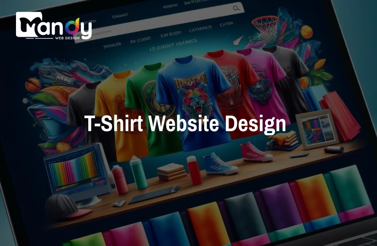
A good T-shirt website design can quickly make customers trust your brand. When people visit your online store, they decide within seconds if they want to stay or leave. That’s why having a clean, easy-to-use design is so important. With the right UI (User Interface), your website can look more reliable and professional.
Smart UI features—like clear product photos, simple menus, and an easy checkout—help customers move smoothly through your website. When visitors can find what they need without confusion, they feel more comfortable and are more likely to buy.
In this blog, you will learn how smart UI design can make your T-shirt website more trustworthy and help increase conversions. These simple tips will guide you in creating a website that looks good, works well, and builds customer confidence.
Why Smart UI Matters for T-Shirt Websites
Your website’s user interface is like the front door to your store. If it looks messy or confusing, people won’t come in. That’s why many brands choose to hire a UI/UX designer to create a clean, professional, and trustworthy layout. In the t-shirt business, where competition is everywhere, your UI can be the thing that sets you apart from others.
Smart UI design affects how people feel about your brand. Keeping up with modern UI/UX trends ensures your website feels fresh, professional, and user-friendly. When your website looks organized and modern, visitors automatically think your business is trustworthy. On the other hand, if your site has broken links, poor images, or confusing buttons, people will leave and buy from your competitors instead.
The t-shirt market is growing fast online. Customers have many choices, so they won’t waste time on a website that frustrates them. A smart UI makes shopping feel easy and enjoyable. When people have a good experience, they remember your brand and come back later.
A good UI also helps you make more money. Investing in the right strategies can improve website UI, keeping visitors engaged and increasing conversions. Studies show that websites with better design convert more visitors into customers. Even small improvements, like making your “Add to Cart” button more visible, can increase your sales. The easier you make it for people to buy, the more they will buy.
Think about your own shopping habits. You probably prefer websites where you can find products quickly, see clear photos, and checkout without problems. Your customers want the same thing. Smart UI gives them exactly that experience.
Essential UI Elements That Build Trust
Trust is everything in online shopping. Understanding the elements of good website design, such as clear contact info, high-quality images, and consistent branding, helps build customer confidence. Your website’s UI elements play a huge role in building that trust. Let’s look at the most important ones.
Professional Logo and Branding: Your logo design should be clear and visible at the top of every page. It tells customers who you are and makes your site look legitimate. Use consistent colors and fonts throughout your website. This consistency shows that you care about details and run a professional business.
High-Quality Product Images: Blurry or small photos make people doubt your products. Use large, clear images that show your t-shirts from different angles. Let customers zoom in to see the fabric texture and print quality. The better your photos, the more confident people feel about buying.
Clear Contact Information: Display your email, phone number, or contact form where people can easily find it. Having a physical address (even just a city and country) helps too. When customers know they can reach you, they trust you more. Hide your contact info and people will think you’re trying to scam them.
Security Badges and Trust Seals: Show SSL certificates, secure payment icons, and any business certifications you have. These small badges tell customers their information is safe. Place them near your checkout button and in the footer of your website.
Customer Reviews and Ratings: Real reviews from real customers are powerful trust builders. Show star ratings on product pages and display customer photos if possible. Even negative reviews can help because they prove your reviews are genuine. Just make sure to respond to complaints professionally.
Clear Return Policy: Make your return and refund policy easy to find and easy to understand. When customers know they can return a t-shirt if it doesn’t fit, they’re more willing to take a chance on buying. Write your policy in simple language without confusing legal terms.
Professional Typography: Use fonts that are easy to read. Avoid using too many different fonts on one page. Your text should be large enough to read comfortably on all devices. Good design typography makes your site look polished and professional.
Fast Loading Speed: A slow website makes people think something is wrong. Implementing speed optimization techniques ensures your pages load quickly, keeping visitors engaged and improving conversions. If your pages take more than three seconds to load, many visitors will leave. Optimize your images and use good hosting to keep your site fast. Speed shows that you care about customer experience.
Smart UI Techniques That Boost Conversions
Converting visitors into customers is the main goal of your website. Smart UI techniques can guide people toward making a purchase without being pushy. Here’s how to do it right.
Visual Hierarchy: Your most important elements should stand out the most. Make your “Add to Cart” button bright and large. Use contrasting colors that catch the eye. Put your best-selling t-shirts in prominent positions. When you guide the eye to what matters, people know what action to take next.
White Space: Don’t fill every inch of your website with content. Empty space around your products makes them stand out more. It also makes your site feel less cluttered and more premium. White space gives customers room to breathe and focus on what they want to buy.
Color Psychology: Colors affect emotions and decisions. Red creates urgency, blue builds trust, green suggests eco-friendliness. Choose website colors that match your brand personality and use them strategically. Your call-to-action buttons should use colors that stand out from your overall design.
Simple Navigation: Your menu should be easy to understand at a glance. Use clear category names like “Men’s T-Shirts,” “Women’s T-Shirts,” and “New Arrivals.” Avoid dropdown menus with too many options. The fewer clicks it takes to find a product, the better.
Search Functionality: Add a search bar at the top of your website. Many customers know exactly what they want and just need to find it quickly. Make sure your search actually works well and shows relevant results. A good search feature can significantly boost your conversions.
Urgency and Scarcity: Show limited stock numbers like “Only 3 left in stock” or use countdown timers for sales. These create a fear of missing out that encourages faster purchases. Just be honest—fake urgency destroys trust.
Clear Call-to-Action Buttons: Every button should tell customers exactly what will happen when they click it. Use action words like “Add to Cart,” “Buy Now,” or “Get Yours Today.” Make buttons large enough to click easily, especially on mobile devices.
Product Filtering: Let customers filter products by size, color, price, style, or collection. Good filters help people find exactly what they want without scrolling through everything. This is especially important if you have a large catalog of t-shirts.
Wishlist Feature: Allow customers to save products they like for later. Many people browse without buying immediately. A wishlist keeps them connected to your store and makes them more likely to return and purchase.
Homepage Design Tips for T-Shirt Brands
Your homepage is usually the first page people see. A well-planned fashion website design ensures that visitors instantly notice your products and key brand messages. It needs to make a great first impression and guide visitors to your products. Here’s how to design a homepage that works.
1. Hero Section
Start with a large, eye-catching image or video at the top of your homepage. Following a clear website design process ensures every element—from hero section to navigation—is strategically placed for best results.
Knowing your website designing cost upfront helps you decide which homepage features deliver the most impact. This should show your best t-shirts being worn by real people. Include a short headline that explains what makes your brand special and a clear button like “Shop Now” or “View Collection.”
2. Featured Collections
Showcase your main product categories right on the homepage. Use attractive images for each collection with clear labels. This helps visitors understand what you sell and find their area of interest quickly. Three to six collections is usually enough.
3. Best Sellers
Display your most popular t-shirts on the homepage. Social proof is powerful—when people see that others are buying certain designs, they want them too. Use a slider or grid to show at least six to eight best-selling products with prices clearly visible.
4. Social Proof
Add a section showing customer photos wearing your t-shirts. User-generated content is more trustworthy than professional photos. You can also include testimonials or reviews from happy customers. This builds credibility instantly.
5. About Section
Include a brief paragraph about your brand story. People connect with stories, not just products. Explain why you started your t-shirt business and what makes you different. Keep it short—just two or three sentences with a link to a full About page.
6. Newsletter Signup
Offer a small discount or freebie in exchange for email signups. Place this in a non-intrusive pop-up or as a banner at the bottom of your homepage. Email marketing is one of the best ways to bring customers back to your store.
7. Clear Value Propositions
Use icons or small banners to highlight your key benefits. Things like “Free Shipping Over $50,” “100% Organic Cotton,” “Easy Returns,” or “Secure Checkout” should be visible. These remove common objections to buying.
8. Navigation Clarity
Your main menu should be simple and clear. Include links to Shop, Collections, About, and Contact. Add a shopping cart icon that shows the number of items currently in the cart. Include a search icon for easy access.
Looking for a Reliable Team to Design Your T-Shirt Website?
Contact Mandy Web Design today and let us build a clean, fast, and high-converting website that gives your brand a strong online identity!
Product Page UI Best Practices
The product page is where the buying decision happens. If this page doesn’t answer all customer questions and build confidence, you’ll lose the sale. Here’s how to optimize it.
Multiple Product Images: Show at least four to six images of each t-shirt. Include front view, back view, close-up of the print or fabric, and someone wearing it. Let customers click to zoom in and see details. The more angles you show, the more confident people feel.
Image Gallery Style: Use thumbnails that customers can click to change the main image. Some sites also use a 360-degree view or video showing the t-shirt being worn. Interactive images engage customers and help them imagine owning the product.
Product Title and Description: Write a clear, descriptive title that includes the main features. Your description should answer all common questions about fabric, fit, care instructions, and design. Use bullet points to make information easy to scan.
Pricing Display: Show the price in large, bold numbers. If the product is on sale, display both the original price (crossed out) and the sale price. Make sure customers can see the price without scrolling. Hidden or confusing prices cause people to leave.
Size Guide: Include a detailed size chart that’s easy to access. Many people abandon carts because they’re unsure about sizing. Show measurements in both inches and centimeters. Include a fit description like “runs true to size” or “slightly oversized.”
Color and Size Selection: Make it super easy to choose options. Use color swatches that look like the actual colors, not just words. Clearly show which sizes are in stock and gray out sold-out options. Update the main image when customers select a different color.
Add to Cart Button: This button should be impossible to miss. Use a contrasting color and place it prominently below the size selection. Make it large and sticky so it stays visible as customers scroll down the page.
Quantity Selector: Include a simple way to adjust quantity before adding to cart. A basic plus and minus button works well. Most orders will be for one item, so default to quantity one.
Product Details Tabs: Organize information into tabs like “Description,” “Size & Fit,” “Material & Care,” and “Shipping & Returns.” Well-planned layouts make these tabs easy to navigate and improve the overall user experience. This keeps the page clean while still providing all necessary information. Customers can click the tab relevant to their question.
Customer Reviews Section: Display reviews right on the product page, not on a separate page. Show star ratings, written reviews, and customer photos if available. Include filters to sort reviews by rating or date. Let customers submit their own reviews easily.
Related Products: Suggest similar t-shirts or products that go well together at the bottom of the page. This encourages customers to explore more options and potentially buy multiple items. Use phrases like “You May Also Like” or “Complete the Look.”
Stock Indicators: Show stock status clearly. Messages like “In Stock,” “Low Stock – Only 2 Left,” or “Sold Out” help customers make quick decisions. If something is sold out, offer an email notification option for when it’s back in stock.
Checkout UI Tips to Reduce Abandonment
Many customers add items to their cart but never complete the purchase. Your checkout process might be the problem. A complicated checkout is like putting obstacles between customers and their purchase. Here’s how to fix it.
1. Guest Checkout Option
Don’t force people to create an account before buying. Many customers just want to complete their purchase quickly. Offer guest checkout as the default option, with account creation as an optional choice after purchase.
2. Progress Indicator
Show customers where they are in the checkout process. Use a progress bar or numbered steps like “1. Cart,” “2. Shipping,” “3. Payment,” “4. Confirmation.” This reduces anxiety because people know how much longer the process will take.
3. Cart Summary
Display a sidebar or section showing all items in the cart, quantities, individual prices, and the total. Include thumbnail images of the products. Let customers easily edit quantities or remove items without going back to a previous page.
4. Clear Form Fields
Use simple, clearly labeled form fields. Mark required fields with an asterisk. Provide helpful error messages if customers enter information incorrectly. Auto-fill common information when possible and allow address lookup by zip code.
5. Multiple Payment Options
Accept all major payment methods including credit cards, PayPal, and digital wallets like Apple Pay or Google Pay. The more options you offer, the more likely customers can use their preferred method. Display payment logos so customers know what’s accepted.
6. Shipping Information
Show shipping costs early in the process, ideally on the product page. Surprise shipping fees at checkout are a top reason for cart abandonment. Be transparent about delivery times and offer multiple shipping options if possible.
7. Security Reassurance
Place trust badges near the payment form. Remind customers that their information is secure. Use phrases like “Secure Checkout” or “Your information is encrypted and secure.” This final reassurance can prevent last-minute doubts.
8. Save Cart Feature
Let customers save their cart and return later. Send abandoned cart emails reminding them about items left behind. Include images of the products and a direct link back to their cart. A small discount code can encourage them to complete the purchase.
9. One-Page Checkout
If possible, fit everything on one page that customers scroll through. This feels faster than clicking through multiple pages. If you must use multiple pages, keep them to a minimum and make navigation easy.
10. Mobile-Friendly Checkout
Make sure all form fields are large enough to tap easily on mobile. Use mobile-appropriate input types (like numeric keyboards for phone numbers). Test the entire checkout process on actual mobile devices.
Mobile UI Considerations for T-Shirt Stores
More than half of online shopping happens on mobile devices. If your t-shirt website doesn’t work perfectly on phones, you’re losing a huge portion of potential customers. Mobile UI requires special attention.
Responsive Design: Your mobile responsive website must automatically adjust to fit any screen size, ensuring images, text, and buttons look perfect on all devices.Images should resize properly, text should remain readable, and buttons should stay tappable. Test your site on multiple devices to ensure everything works smoothly.
Mobile Navigation: Use a hamburger menu icon that opens a clean, organized menu. Keep menu items large enough to tap accurately with a finger. Avoid hover-based navigation that doesn’t work on touch screens. Make the shopping cart easily accessible with a sticky icon.
Touch-Friendly Elements: All buttons and links should be at least 44×44 pixels so they’re easy to tap. Leave enough space between clickable elements so people don’t accidentally tap the wrong thing. This is especially important for size and color selectors.
Simplified Layout: Mobile screens are small, so prioritize the most important information. Implementing modern website design trends ensures your mobile site looks fresh, clean, and user-friendly. Use a single-column design layout instead of multiple columns. Stack elements vertically and make generous use of white space. Less clutter means easier navigation.
Fast Loading: Mobile users often have slower internet connections than desktop users. Optimize images specifically for mobile devices. Reduce file sizes without sacrificing quality. Remove any unnecessary elements that slow down your site. Every second counts on mobile.
Thumb-Friendly Design: Most people hold phones in one hand and tap with their thumb. Place important buttons and navigation elements where thumbs can easily reach them, typically in the bottom half of the screen or in the center. Avoid placing critical buttons in the top corners.
Mobile Forms: Make form filling as painless as possible. Use auto-fill for addresses and payment information. Minimize the number of fields required. Use the correct keyboard type for each field (numbers for phone, email keyboard for email). Allow customers to save information for future purchases.
Product Images on Mobile: Swipeable image galleries work better than thumbnail grids on mobile. Let customers swipe left and right to see different product images. Pinch-to-zoom should work smoothly. Images should be high quality but optimized for fast loading.
Mobile Checkout: Simplify the checkout process even more for mobile users. Consider a single-page checkout or minimize the number of steps. Large, obvious buttons guide users through the process. Always show a clear total and what customers are buying.
Mobile Testing: Don’t just rely on responsive design tools. Actually test your website on real phones and tablets. Try completing a purchase from start to finish on mobile. Ask friends or family to test it too. Fix any friction points they encounter.
How Smart UI and SEO Work Together
Your website’s UI and SEO (Search Engine Optimization) are closely connected. A website designed with smart UI principles naturally performs better in search engines. Here’s why this matters for your t-shirt business.
User Experience Signals: Search engines like Google track how people interact with your website. If visitors leave quickly or don’t click around, Google thinks your site isn’t helpful. Good UI keeps people engaged longer, which tells search engines your site is valuable. This improves your rankings.
Mobile-Friendliness: Google uses mobile-first indexing, meaning it primarily looks at the mobile version of your site when ranking it. A mobile-friendly UI isn’t just good for customers—it’s essential for SEO. Sites that don’t work well on mobile get ranked lower in search results.
Page Speed: Fast-loading pages are a ranking factor for Google. Smart UI design includes optimizing images, minimizing code, and using efficient layouts. When you improve your UI for user experience, you’re also improving your SEO performance.
Clear Navigation and Structure: Creating an SEO-friendly website structure helps search engines index your pages properly and makes it easier for visitors to navigate your site. A well-organized navigation menu helps both customers and search engines find your content. Use descriptive category names and logical hierarchies.
Descriptive URLs: When you create product pages, use URLs that describe the product clearly. Instead of “yourstore.com/product-123,” use “yourstore.com/mens-graphic-t-shirt-vintage-design.” This helps with SEO and also helps customers understand what page they’re on.
Image Optimization: Every product image should have descriptive alt text. This helps visually impaired customers using screen readers and also helps search engines understand what’s in the image. Use file names that describe the image before uploading.
Content Quality: Your product descriptions, blog posts, and page content should be original and helpful. Search engines reward unique, valuable content. Don’t copy descriptions from suppliers—write your own. Include keywords naturally but focus on being helpful first.
Internal Linking: Link related products and pages together throughout your site. This helps customers discover more products and helps search engines crawl your entire site. Use descriptive anchor text like “view our organic cotton collection” instead of “click here.”
Schema Markup: Add structured data to your product pages. This helps search engines display rich snippets in search results, showing product ratings, prices, and availability. Rich snippets attract more clicks from search results.
Reduce Bounce Rate: Good UI design keeps visitors on your site longer. They explore multiple pages, view several products, and engage with your content. Lower bounce rates signal to search engines that your site provides value, which can improve your rankings.
Why Choose Mandy Web Design for Your T-Shirt Website
Mandy Web Design is a leading website designing company in India known for creating clean, responsive, and high-converting websites tailored to each business. We focus on building T-shirt websites that load fast, look professional, and make customers trust your brand from the first click. With custom layouts, smart UI elements, and modern design styles, we ensure your online store stands out and delivers a smooth shopping experience.
We offer affordable web design packages that fit every business size—whether you’re a small startup or a growing clothing brand. Our pricing is simple, transparent, and budget-friendly, with packages starting from just ₹13,000.
Mandy Web Design provides complete end-to-end services to help your T-shirt brand grow online. Our services include custom website design, ecommerce website design, UI/UX design, responsive design, website redesign, WordPress website design, and website maintenance services. Everything you need to build a strong online presence is available in one place.
Ready to Upgrade Your T-Shirt Website?
Let Mandy Web Design create a smart UI-powered website for you. Get in touch today and start building a stronger online presence!
FAQs About T-Shirt Website Design
The cost of designing a T-shirt website depends on features, pages, and customization needs. At Mandy Web Design, we offer affordable packages starting from just Rs 13,000, giving businesses a clean, responsive, and conversion-focused website without overspending.
UI design helps customers easily browse products, understand details, and complete purchases without frustration. A clean, simple interface builds trust, keeps visitors on your site longer, and encourages them to explore more items, leading to higher conversions and better user experience.
A strong T-shirt website needs clear product photos, size charts, simple navigation, filters, customer reviews, fast loading pages, and a smooth checkout. These features help users quickly find what they want and feel confident while shopping, improving trust and increasing overall sales.
Smart UI removes confusion, simplifies steps, and guides users toward buying. Clear CTAs, product layouts, and easy navigation help customers make decisions faster. When visitors experience fewer barriers and find what they need quickly, conversions naturally increase, improving your store’s overall performance.
A custom design isn’t required but offers major advantages. It makes your brand look unique, builds trust, and delivers a smoother user experience. Custom layouts match your style, highlight your products better, and help your website stand out in a crowded market.
Yes, mobile-friendly design is essential. Most customers shop using their phones, so your website must load fast and look clean on all screens. A mobile-responsive layout improves user experience, reduces bounce rates, and helps increase conversions for your T-shirt business.
Costs vary based on features and customization. Mandy Web Design offers affordable packages starting from just ₹13,000, giving you a professional, clean, and mobile-friendly website at a budget-friendly price. You get reliable design, smooth functionality, and everything needed to grow online.
Mandy Web Design is a trusted website design and development in India known for creating clean, responsive, and conversion-driven T-shirt websites. We offer custom designs, mobile-friendly layouts, SEO-friendly structure, affordable pricing, and full support to help your brand attract customers and grow online.

About the Writer
Abhishek Thakur
Sr. Content Writer at Mandy Web Design
Abhishek Thakur is the Senior Content Writer at Mandy Web Design, where he crafts engaging content for the company’s website, blog, and marketing campaigns. With 5+ years of experience in digital marketing and SEO content creation, he specializes in turning complex topics into easy-to-understand, actionable strategies that help businesses grow online. He is passionate about creating high-quality, value-driven content that connects with audiences and builds brand authority. When he’s not writing, he enjoys exploring new ideas, learning the latest marketing trends, and improving his creative skills.