The internet is full of websites—some catch your attention instantly, while others are quickly forgotten. Have you ever wondered why that happens? One big reason is the layout. A well-designed web layout doesn’t just look good; it helps users find what they need easily, keeps them engaged, and makes the overall experience smooth and enjoyable. Whether it’s an online store, a blog, or a company website, the layout plays a huge role in how visitors interact with the content.
Many businesses, especially small ones, often overlook the importance of layout and jump straight into colors, images, or text. But layout is the foundation—without a solid structure, even the best visuals won’t work well. From where the logo sits to how content flows down the page, every piece has a purpose.
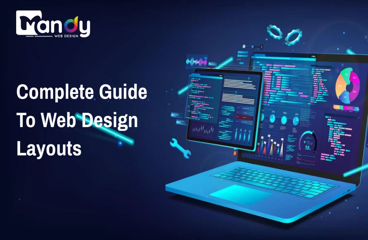
In this complete guide to web design layouts, we’ll walk you through the different layout styles, key components that make a strong design, and best practices to follow.
What Is a Web Design Layout?
A web design layout refers to the way visual elements are arranged on a web page. This includes headers, footers, images, text, navigation menus, and more. It sets the stage for how users experience and interact with your site.
The layout determines:
- The flow of content
- What users see first
- How easily users can navigate
- Overall user engagement
For businesses offering web design services, understanding layout structure is essential to delivering functional and beautiful websites.
Popular Web Design Layout Styles
1. F-Layout
Inspired by how people read content (from left to right, top to bottom), the F-Layout places the most important elements along the top and left side.
Best for: Blogs, news sites, and content-heavy pages.
2. Z-Layout
This layout guides the eye in a Z-pattern: left to right at the top, diagonal down the page, and left to right again.
Best for: Landing pages and websites with minimal content.
3. Grid Layout
A grid layout divides the page into equally sized sections. It ensures balance and uniformity.
Best for: Portfolios, galleries, and ecommerce stores.
4. Single Column Layout
A simple, mobile-friendly layout with one content column.
Best for: Blogs and mobile-first websites.
5. Split Screen Layout
Splits the screen into two sections, often with contrasting visuals or dual calls to action.
Best for: Product comparisons or showcasing two offers.
6. Asymmetrical Layout
Breaks away from standard grid patterns to create a dynamic, modern feel.
Best for: Creative brands and businesses offering creative web design services.
Key Components of a Great Web Design Layout
1. Header and Navigation
The header often contains the logo and navigation menu. This is crucial for guiding visitors. For companies offering web design agency services, a strong navigation structure should be a top priority.
2. Hero Section
The large banner at the top of a site, also known as the web banner design area. This section usually contains a headline, subheadline, and call to action.
3. Content Area
This is where the core message, services, or products are displayed. For small businesses using web design services for small business, content should be simple, scannable, and focused.
4. Sidebar
Used for additional information, contact forms, or calls to action.
5. Footer
The footer often includes contact details, social media links, newsletter signups, and legal information.
6. Whitespace
Whitespace or “negative space” is the blank area between elements. It enhances readability and reduces visual clutter—a must for any web design services company in India or worldwide.
Best Practices for Web Design Layouts
1. Keep It Simple
Don’t overwhelm users. Use simple layouts that are easy to navigate. Even dynamic web designing services must prioritize clarity over flashy animations.
2. Mobile-First Design
More people browse on mobile than desktop. A mobile-first layout ensures accessibility and responsiveness.
3. Consistent Design Elements
Use consistent fonts, colors, and icons throughout the site.
4. Strong Visual Hierarchy
Make sure your layout guides users naturally from most to least important information.
5. Use of Grids and Alignment
A clean grid keeps your layout structured and balanced. This is especially critical for Custom Web Solution providers.
6. Speed and Performance Optimization
Large files or unoptimized elements slow down websites. A good layout doesn’t just look good—it loads fast.
7. Test and Optimize
Use A/B testing to see how users interact with your layout. It’s essential for improvement.
Layout Tips by Website Type
Business Websites: Focus on clean navigation, trust elements (testimonials, certifications), and a bold CTA.
Ecommerce Websites: Highlight featured products, search functionality, and clear product categories.
Blogs: Use an F-layout, simple sidebar, and clear typography.
Portfolios: Grid or asymmetrical layouts work best. Include filters and categories.
Landing Pages: Use Z-layouts with focused CTAs. Avoid clutter.
Common Layout Mistakes to Avoid
- Ignoring mobile responsiveness
- Overcrowded design
- Weak navigation
- Lack of CTA focus
- Inconsistent styles
These mistakes can reduce user engagement, especially if you’re in the web design service industry.
Benefits of a Well-Designed Layout
- Better user experience
- Higher conversion rates
- Easier navigation
- Stronger branding
- Improved SEO ranking
That’s why businesses seeking the best web design services should prioritize layout just as much as visuals.
How to Choose the Right Layout
Ask the following questions:
- Who is my audience?
- What is the goal of this website?
- What content needs priority?
- How should users navigate the page?
Your answers will shape the ideal layout. For instance, a web design service for small business might benefit from a single-column layout with simple CTAs.
Custom Layouts vs. Templates
Custom Web Solution providers offer fully tailored layouts built around your brand. Templates are faster and cheaper but may limit flexibility.
For businesses looking for affordable web design services, templates are a good starting point. But custom layouts provide a unique edge.
Future Trends in Web Design Layouts
- AI-powered layout adjustments
- 3D visuals and micro-interactions
- Scroll-triggered animations
- Voice navigation integration
Creative web design services must stay updated with trends to stay competitive.
Why Mandy Web Design Is the Right Choice for Your Web Design Layout Needs
When it comes to building layouts that not only look stunning but also drive real results, Mandy Web Design stands out as the best web design company offering both creativity and strategy.
Mandy Web Design combines visually appealing design with user-first functionality. With over a decade of experience, our team has delivered custom website design solutions for businesses across industries, ensuring each site layout enhances engagement, leads, and conversions.
Here’s what you get when you work with Mandy Web Design:
- Custom Layouts Built Around Your Brand: No cookie-cutter templates—your site layout is tailored to your business goals and target audience.
- Mobile-Optimized Designs: All layouts are responsive and crafted with a mobile-first approach, ensuring seamless performance across devices.
- Clean Navigation Structures: We focus on simplicity and flow, guiding users naturally through your content with intuitive layouts.
- Performance-Focused Development: From layout to code, our websites are optimized for speed, SEO, and conversions.
- Affordable Packages: We offer web design services for small businesses as well as scalable options for growing enterprises—all without compromising quality.
- Creative Visuals and Hero Banners: Our web banner design services help you make a bold first impression with custom, high-converting headers.
FAQs About Web Design Layouts
A well-structured layout improves how users interact with a website by guiding their attention, simplifying navigation, and enhancing readability. It directly impacts bounce rates, time on site, and overall satisfaction—key metrics for any successful digital presence.
An F-layout mimics how users naturally scan content-heavy pages (like blogs or news sites) from left to right and top to bottom. A Z-layout, on the other hand, follows a Z-pattern and is ideal for simpler pages like landing pages with minimal elements and a strong call to action.
Start by defining your audience, goals, and content priorities. For example, a portfolio might benefit from a grid or asymmetrical layout, while a blog works well with a single-column or F-layout. Always consider mobile responsiveness and load speed too.
Common mistakes include ignoring mobile optimization, using cluttered or inconsistent designs, weak navigation, and lack of visual hierarchy or CTAs. These can result in poor user engagement and higher bounce rates.
Mandy Web Design is known for creating layouts that are not only visually appealing but also conversion-driven. Our designs focus on user experience, SEO, and branding, making us one of the best web design companies in India.
Yes, all our web design layouts are crafted with a mobile-first approach. Whether it’s a single-column layout or a split-screen design, we ensure your website performs flawlessly on smartphones, tablets, and desktops.
Absolutely. We specialize in custom web solutions that align with your brand’s goals. Whether you’re a small business or an enterprise, we tailor the entire structure—from navigation to visuals—to deliver measurable results.
In addition to layout and UI/UX design, Mandy Web Design offers web banner design services, ecommerce development, landing page creation, SEO integration, and performance optimization—everything you need for a high-performing website.

About the Writer
Mandeep Singh Chahal
Founder/CEO, Mandy Web Design
Mandeep Singh Chahal is the proud Founder/CEO of Mandy Web Design. After completing his graduation from Punjab University, Mr. Mandeep started gaining experience in SEO, Digital Marketing, Web Designing, and Business Development. His years of experience have earned him a reputed Web Design Company – Mandy Web Design.