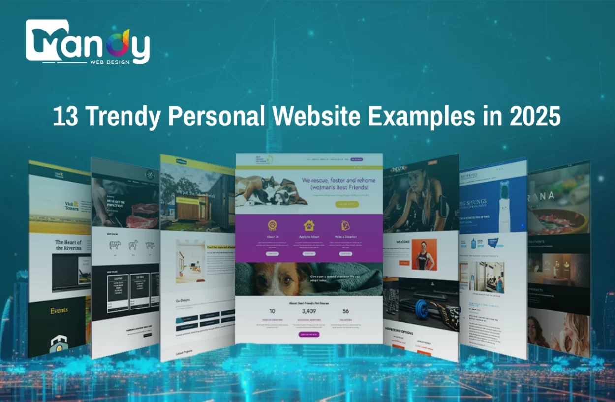
Personal websites have become one of the most effective ways to build a strong online presence in 2025. With more professionals and creatives showcasing their portfolios, skills, and achievements online, having a well-designed personal website example helps you stand out. It’s your digital identity — a space where you control how others see your personal brand.
According to a 2024 survey by Adobe, 76% of professionals reported that having a well-designed personal website positively influenced potential clients’ or employers’ perception of their skills and credibility.
In recent years, personal website design trends have evolved to focus more on storytelling, visual appeal, and user engagement. From bold typography and interactive layouts to minimalist themes and dynamic animations, designers are experimenting with styles that reflect individuality and professionalism.
In this blog, we’ll explore 13 trendy personal website examples in 2025 that are redefining modern web design. These examples will inspire you with fresh ideas, helping you choose the perfect design style to create a personal website that’s both beautiful and impactful.
Why Your Personal Website Matters in 2025
In 2025, creating a personal website is no longer optional—it’s a powerful tool for your personal brand, career, and creative voice. With so many freelancers, creatives, professionals and entrepreneurs showcasing their work online, your personal website acts as your digital identity. It’s where people go to learn about you, your skills, your story, and your uniqueness. Having a website that is not just functional, but also feels like “you”, gives you a competitive edge.
A well-designed personal website, crafted with expert UI/UX design services, helps you stand out in a crowded digital world. It shows you take your work seriously, you value quality, and you can deliver an experience, not just a page. Today’s visitors expect more than just text and images—they expect something that feels alive, authentic and engaging.
The good news: The design world has evolved. There are fresh styles, new trends, and many ways to express your personality through your personal web page design.
What’s Trending in Website Design for 2025
Before diving into individual examples, it’s helpful to know the larger trends shaping the web design world in 2025. That way you’ll know not just what you’re seeing but why it’s happening.
1. Mobile-First & Performance
2. Bold Typography, Colors & Personality
2025 design puts more emphasis on character—big fonts, expressive typography, vivid glows of color, and playful visuals inspired by professional website examples.
3. Micro-Interactions & Motion
Crowds are no longer satisfied with static pages. Micro-animations, custom cursors, interactive transitions—these small touches elevate the feel.
4. Storytelling & Visual Work
Personal websites are increasingly storytelling platforms: showing how you worked, what you believe, what your style is. The design trends emphasise emotional connection and authenticity.
5. Sustainable & Inclusive Design
In 2025 there’s more talk about sustainability (eco-friendly design), inclusive design (accessibility), and authenticity rather than perfect polish.
6. Minimalism + Space
While bold elements are trending, minimalism still holds power—white space, clean layout, letting visuals breathe.
13 Trendy Personal Website Styles (with Examples and Takeaways)
This section highlights 13 popular personal website styles in 2025. It clearly explains each design trend with examples and tips, helping you understand how to create a modern, attractive website that matches your personality and builds a strong online presence.
Style 1: Bold Block Layouts with Vibrant Contrast
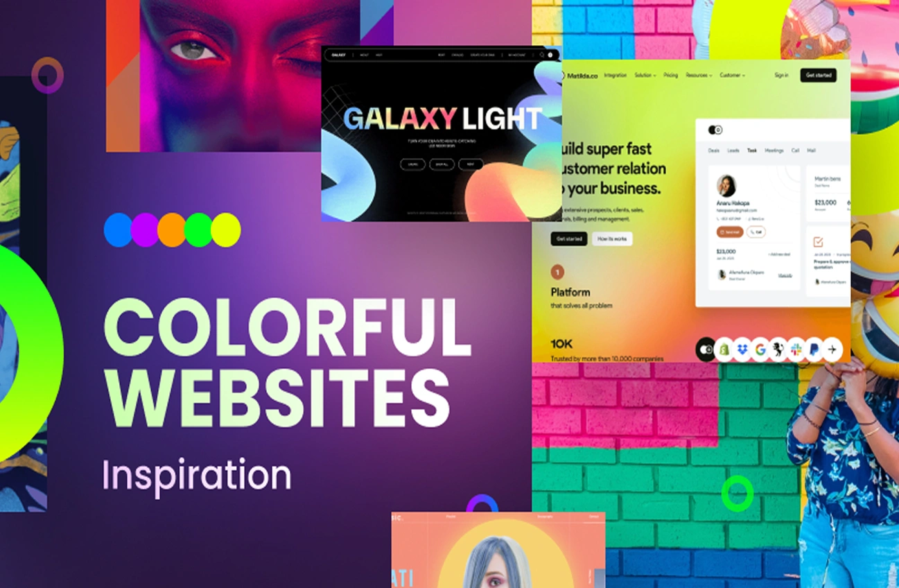
What it is: The page is divided into large blocks: one colour, another image, another text section. High contrast colours, bold typography, lots of visuals.
Why it works: It grabs attention, segments content clearly, makes the visitor scroll with interest. Trend-watchers mark “big blocks with vivid contrast” as a top trend for 2025.
How you can apply it: Use sharply differing background colours for major sections (e.g., intro, work, about). Pick one or two accent colours that reflect your brand. Use bold font headings. Make sure each block is meaningful (not filler). Ensure readability.
Tip: Keep images and visuals inside the blocks consistent in style (so it looks intentional). On mobile, ensure blocks stack cleanly and contrast doesn’t harm readability.
Style 2: Minimalist Portfolio with White Space Emphasis
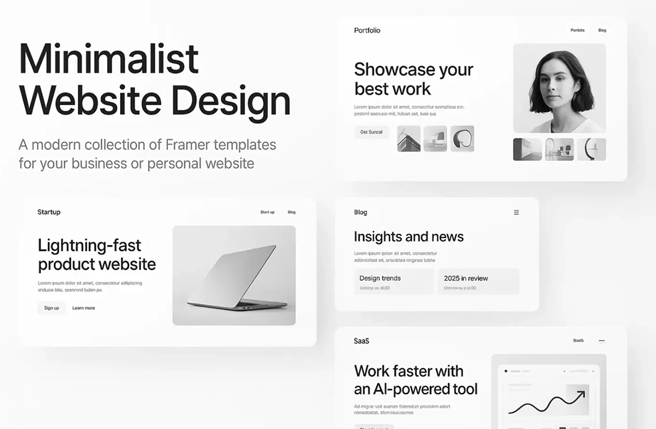
What it is: Clean layout, lots of empty space, restrained colour palette (black/white/grey with one accent colour), focus on visuals or content rather than decoration.
Why it works: Minimalism helps visitors focus on your work and message. The white space helps visual hierarchy. Experts mark white space as increasingly important.
How you can apply it: Choose a simple layout: hero image, a few featured works, about section, contact. Limit colours. Ensure typography is clear. Let your work speak.
Tip: This style is perfect for a sample personal homepage that values simplicity and elegance.
Style 3: Hand-Drawn/Sketchbook Aesthetic
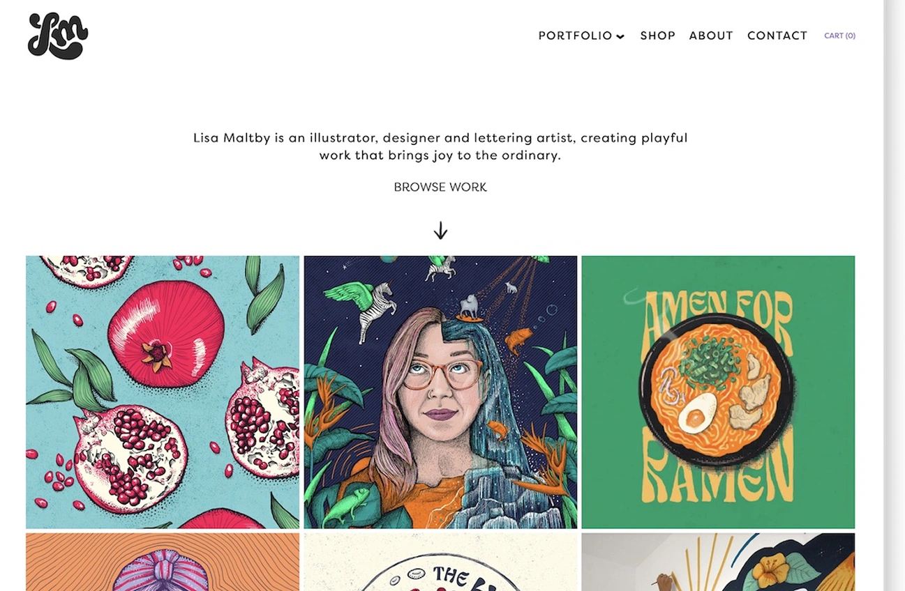
What it is: Incorporates hand-drawn icons, sketches, organic shapes, sometimes textured backgrounds. It feels personal, creative, less “corporate”.
Why it works: In 2025 the “Sketchbook” trend is highlighted: designers want personal creative voice, imperfect elements, human-touch.
How you can apply it: Use your drawings or hire an illustrator. Have a hero graphic that looks hand-sketched. Use handwritten fonts or light textures. Keep the layout structured so it doesn’t look messy.
Tip: Make sure the hand-drawn look still performs well: good contrast, load times are optimized, elements scale properly on mobile.
Style 4: Vivid Glow & Bold Colour Palette
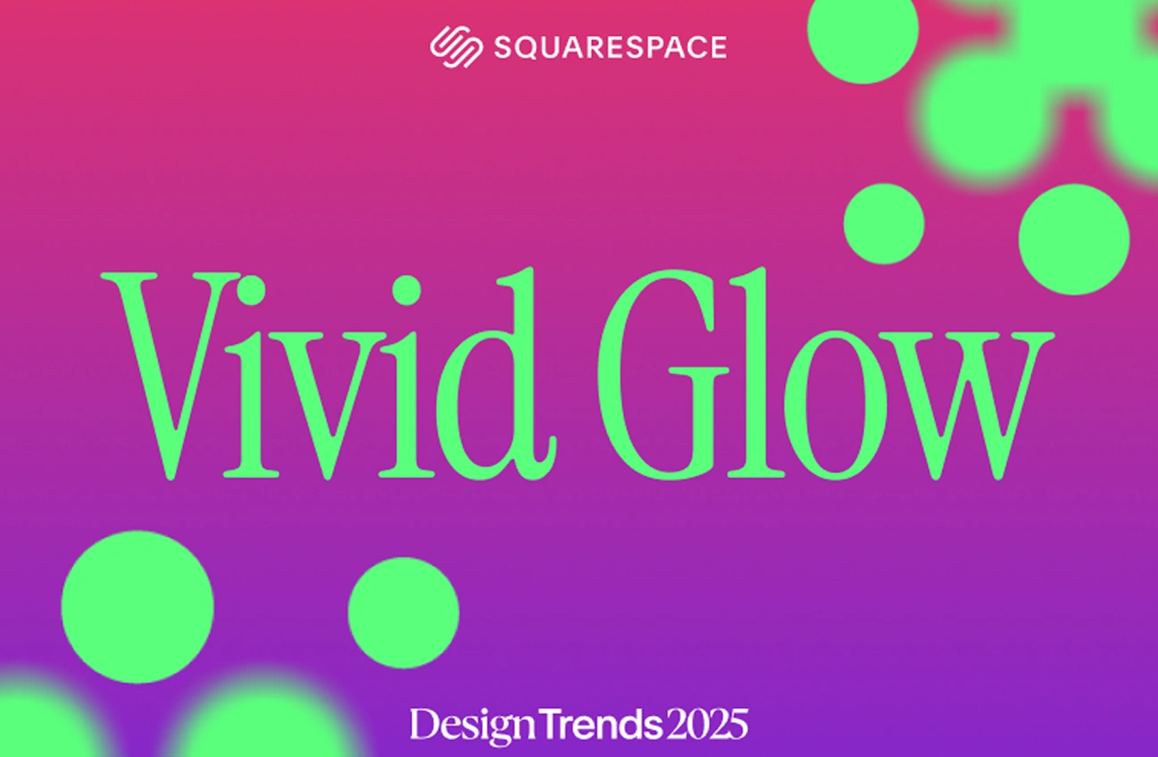
What it is: Strong, bright colours. Possibly neon or glowing accents. High energy visuals. It might feel more expressive, almost rebellious.
Why it works: The “Vivid Glow” trend is described as a rebellion against the safe minimalist palette—bright colours used intentionally to make an impression.
How you can apply it: Pick one or two bright colours and use them for buttons, headings, animations, hover effects. Keep the rest of the design more restrained so the colours pop.
Tip: Check accessibility—very bright colours can be hard to read. Use high contrast, and test on different screens. Also ensure performance (glow effects can cause extra load).
Style 5: Interactive & Immersive Micro-Interactions
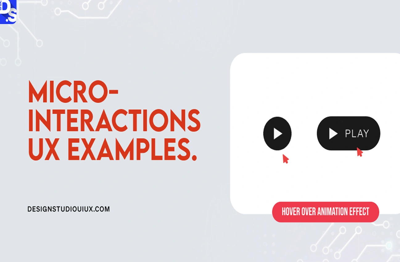
What it is: Small animations on hover, smooth transitions, cursor changes, scroll triggers, interactive sections. These interactions make the site feel alive.
Why it works: Motion and interaction create delight, improve engagement. Design trend lists for 2025 mark micro animations and custom cursors as rising.
How you can apply it: On your site, implement hover effects on thumbnails, animated entry for sections as you scroll, a custom cursor perhaps (but subtle). Ensure that the interactions don’t interfere with usability.
Tip: As always, test for performance. Mobile devices may struggle with heavy animations. Provide fall-backs. Don’t let the motion overshadow your content.
Style 6: Dark Mode / Dark Aesthetic
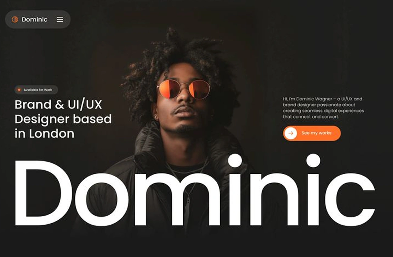
What it is: A site designed with dark backgrounds (black or charcoal), light text, rich visuals. It is moody, modern, and can feel premium.
Why it works: Dark mode continues to gain popularity (for both aesthetic and usability reasons). Web design trend articles for 2025 cite its rise.
How you can apply it: You might design your site in dark mode by default, or provide a toggle (light/dark). Key is making sure readability, contrast and user comfort are maintained.
Tip: If you choose dark mode, ensure that images look good on a dark background (transparent PNGs may appear differently). Also consider how your brand colours look in a dark context.
Style 7: Organic Matter / Nature-Inspired Design
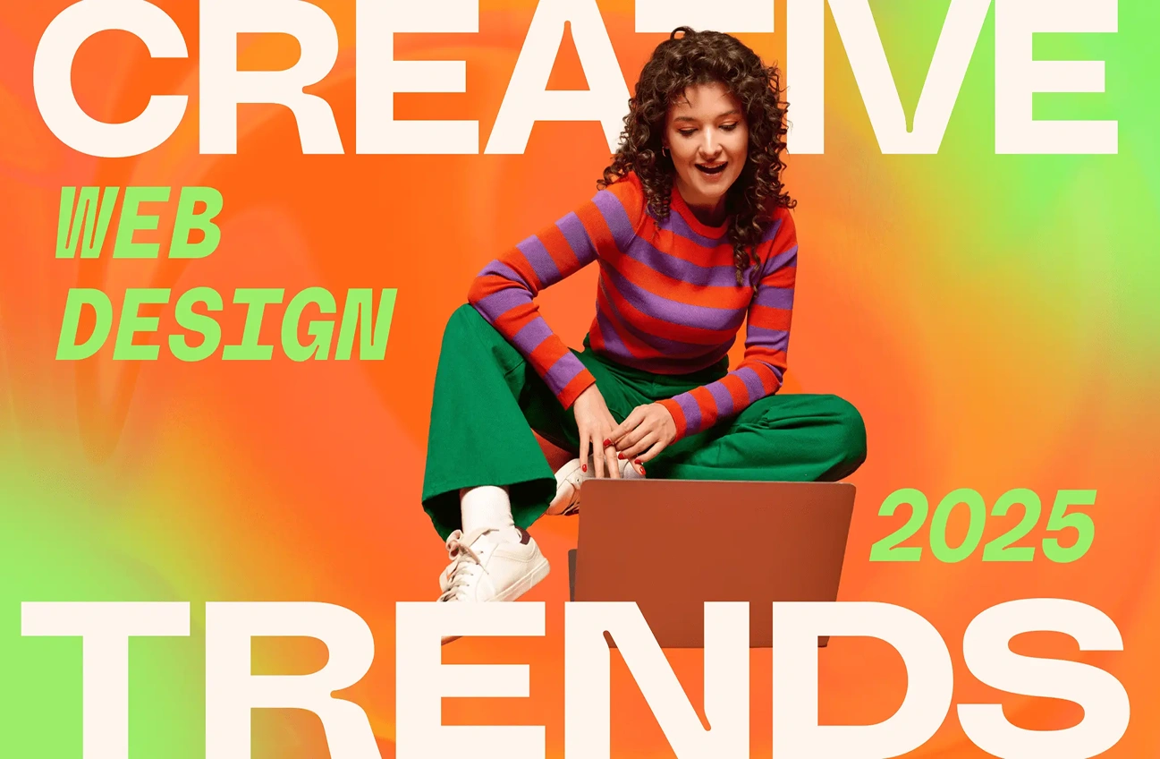
What it is: Design that draws from nature: earthy colours (greens, browns, blues), organic shapes, textures like paper or stone, hand-crafted feel.
Why it works: According to trend articles, the “Organic Matter” aesthetic reflects a yearning to reconnect with nature in digital form.
How you can apply it: Use natural colour palettes, incorporate textures subtly, use fluid shapes rather than strict grids. Let your design breathe with soft edges.
Tip: Even with organic elements, keep your site clean and modern. Nature inspired doesn’t mean messy. Balance is key.
Style 8: Personal Blog / Story-Led Format
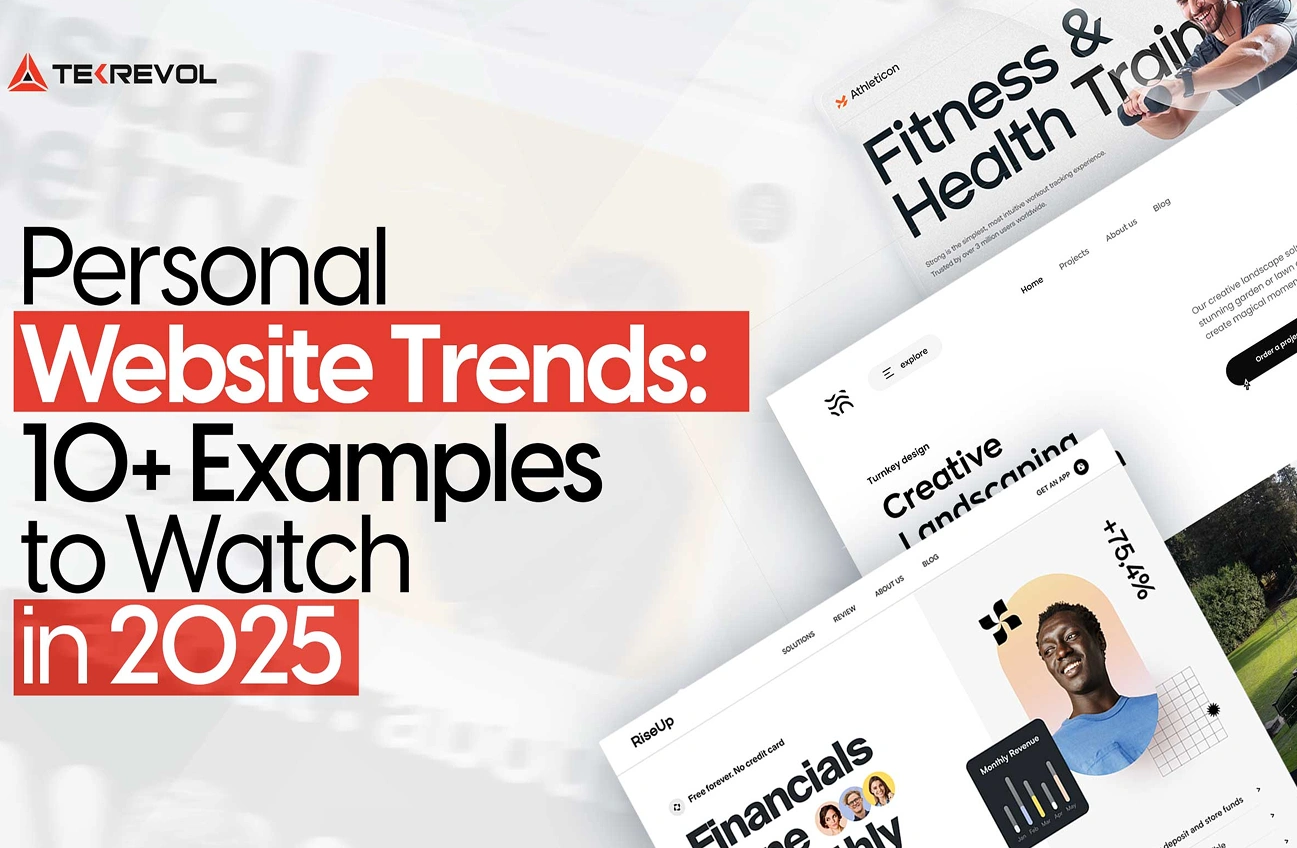
What it is: Your website becomes more than a portfolio—it tells your story. It has sections for your thoughts, process, behind-the-scenes, perhaps a blog built into your personal site.
Why it works: Visitors want to connect with the person behind the work. Storytelling builds trust and helps your brand. Many portfolio example lists emphasise this.
How you can apply it: Dedicate a page or section to your story—why you do what you do, your background, lessons learned. Use visuals, perhaps a timeline. Include a blog or journal if you enjoy writing.
Tip: Keep the blog updated—if you promise content but never publish, it can feel stale. Also ensure your core portfolio remains easy to navigate.
Style 9: 3D & Immersive Visual Effects
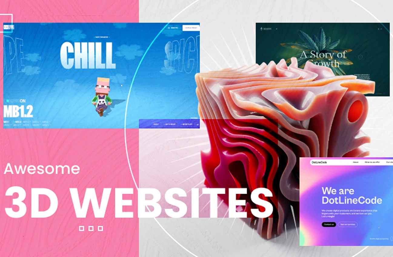
What it is: Use of 3D graphics, depth, layered visuals, maybe WebGL, interactive scenes that respond to scroll or cursor.
Why it works: As web technology matures, more personal sites are using immersive visuals. Trend articles talk about immersive, 3D experiences as part of 2025’s evolution.
How you can apply it: If you have the technical skills (or partner with a developer), include subtle 3D elements such as a rotating model, parallax layers, or depth transitions. Make sure performance is optimized.
Tip: Ideal for creatives who want to create a personal webpage with cutting-edge visuals.
Style 10: Resume-First One-Page Website
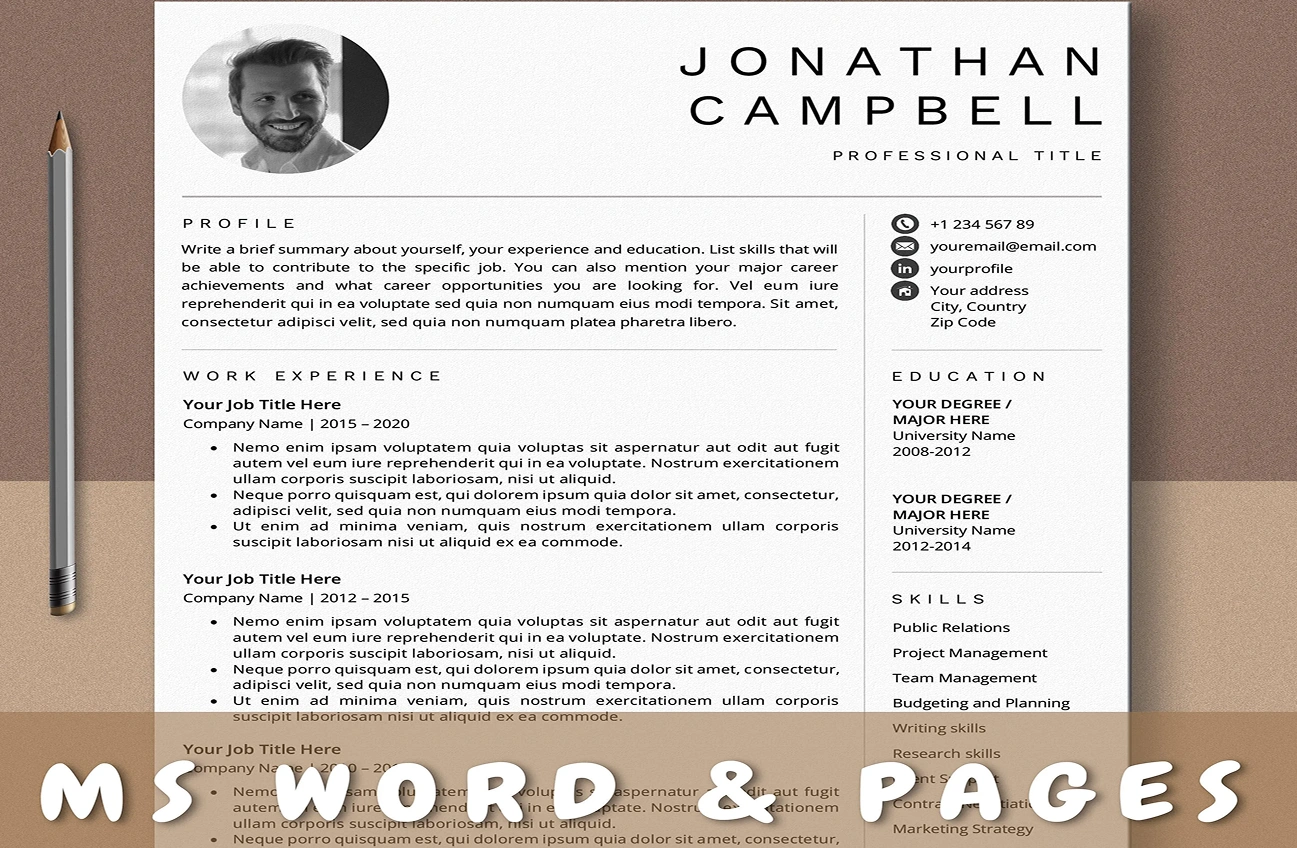
What it is: A compact one-page website built around your resume, skills, highlights, maybe a portfolio section, but everything in a single page rather than multi-page.
Why it works: For many professionals, simplicity wins. A one-page site ensures visitors see everything without clicking around. Portfolio example lists include this type.
How you can apply it: Structure the page: Hero (name + brief tagline), Skills/Expertise, Selected Works, About Me, Contact. Use anchor navigation at top. Keep it clean, easy to scan.
Tip: If you have many projects, you might still direct to a separate “Work” page, but keep the main one-pager tight. Use call-to-action (CTA) for contact or hire-me.
Style 11: Dark Mode + Colour Accent Hybrid
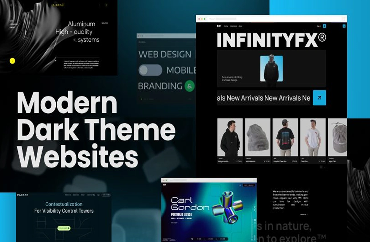
What it is: The site uses a dark background (as in Style 6) but pairs it with a strong accent colour (neon, vivid) for headings, highlights and interactive elements.
Why it works: Combines the premium feel of dark mode with the expressive bold colours of 2025. Offers both sophistication and personality.
How you can apply it: Choose a dark base (charcoal or navy), pick a strong accent (electric blue, neon pink, lime green). Use the accent colour sparingly for focus: buttons, hover states, icons.
Tip: Ensure readability with light text on dark. Test on mobile and daylight brightness. Make sure accent colour is consistent across the site for brand cohesion.
Style 12: Glassmorphism / Semi-Transparent Layers
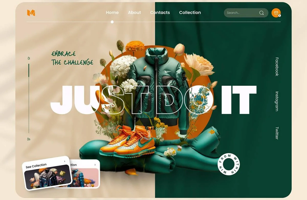
What it is: UI elements using semi-transparent backgrounds, blur effects, layered cards above backgrounds—giving a “glass” effect.
Why it works: Many designers highlight glassmorphism as part of the evolving aesthetics for 2025. It adds depth and visual interest without being heavy.
How you can apply it: For cards (project previews), use a semi-transparent background with a subtle blur. Keep the background image or colour visible. Use shadows, spacing.
Tip: This sleek effect is trending among best personal brand websites that want a modern touch.
Style 13: Sustainable / Eco-Conscious Design
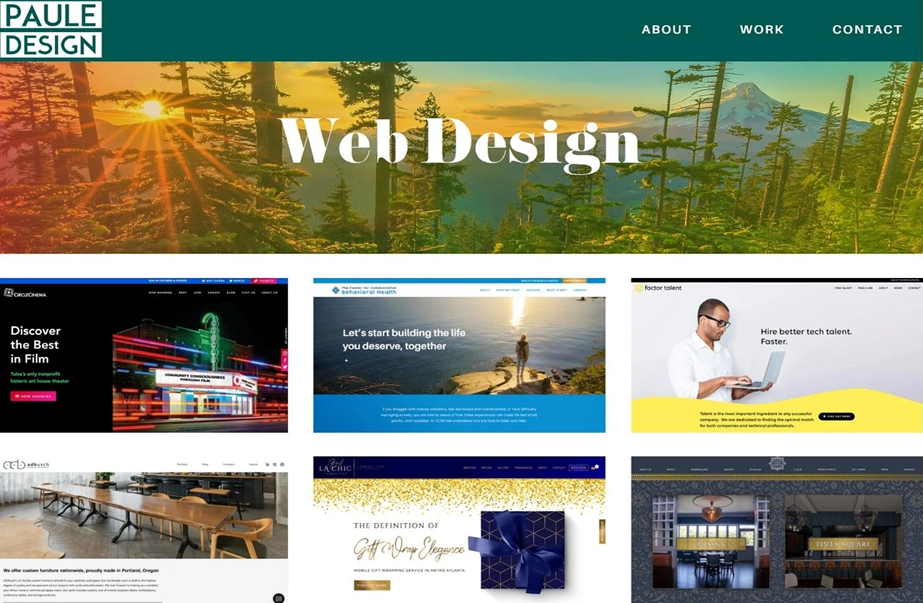
What it is: Design choices emphasising environmental consciousness: earth-tone palette, minimal heavy media, efficient design, sustainable messaging.
Why it works: In a world increasingly aware of sustainability, web design is too. A personal site that signals you care about efficient performance, low energy, and purposeful messaging sets you apart. Trend discussions for 2025 emphasise sustainable design.
How you can apply it: Use static images over heavy videos, use compressed images, favour clean code, pick a palette inspired by nature, include a statement about your values. Use lazy loading.
Tip: Avoid being preachy—make it genuine. Provide value, not just a green badge. Also ensure the user experience is still high quality.
How to Choose the Right Style for You
Choosing a style among the many above depends on your audience, your personality, your goals. Here are some guiding questions:
- Who is your audience? If you’re a corporate professional, a minimalist or dark mode style might fit. If you’re a creative illustrator, you might learn hand-drawn or vivid colours.
- What is your brand/personality? Your site should feel like you. If you’re fun and quirky, don’t pick something ultra-serious. If you’re highly professional, a loud neon palette might feel off.
- What is the purpose of the site? Portfolio? Blog? Resume? A combination? Choose a layout style that supports your main goal (show work, tell story, drive contact).
- What resources do you have? Some styles (3D, heavy micro-interactions) will require more technical effort. Others (minimal or one-page) are easier to implement.
- How will it perform? Whatever style, it must load fast, look good on mobile, and be accessible. Trends are great, but if your site is slow or unreadable, you lose value.
- How timeless is it? Trends come and go. Pick a style that suits your long-term presence, or design it so you can refresh colours/fonts without complete redesign.
Implementation Tips: Bring Your Personal Website to Life
Once you’ve chosen a style, here are practical tips to help you execute your personal website effectively:
a) Use a Strong Hero Section
Your homepage’s hero is the first thing visitors see—name, tagline, maybe a photo or graphic. Make it clear who you are and what you do. Use bold typography or a unique visual to match your chosen style.
b) Keep Navigation Simple
Personal websites benefit from simple nav: Home, About, Work/Portfolio, Blog (optional), Contact. If you’re one-page, use anchor links. Less confusion = better conversion.
c) Show Your Work Prominently
If you’re showcasing portfolios or case-studies, ensure visuals are high quality, descriptions are concise, and each work item has a clear context (what you did, your role, the outcome). This aligns with best practices in portfolio websites.
d) Use Good Typography
Choose readable fonts, appropriate sizes and spacing. For bold style or vivid colour themes, make sure contrast is sufficient. For hand-drawn or sketch styles, be careful with decorative fonts—readability still matters.
e) Optimize for Mobile & Speed
More than ever, users will view your website on mobile. Make sure your design is responsive, images are optimized, animations are performant. As web-design trends stress, mobile-first and speed matter.
f) Include a Strong Call to Action (CTA)
What do you want visitors to do? “Hire me”, “View portfolio”, “Get in touch”—make it clear. Even for a personal site, guiding action matters.
g) Keep Content Fresh
If you include a blog or ‘what’s next’ section, keep it updated. A stale site feels abandoned. For a one-page resume style, update your most recent work and skills.
h) Use Analytics & Monitor Performance
Track how users behave: which sections they click, how long they stay, what devices they use. Use this data to refine your layout, style, or content.
i) Ensure Accessibility & SEO
Don’t forget alt-text for images, keyboard navigation, contrast levels, semantic HTML. For your site to rank and be inclusive, accessibility is key. Also ensure meta tags, structured data, performance – all help your site confidence in search results.
If you’re planning your personal website, working with experts offering custom web design services ensures your site looks original and performs well.
Mistakes to Avoid
When building your personal website in 2025, avoid these common pitfalls:
- Over-complicating the layout: A fancy style is good, but if users can’t find what they need quickly, you lose value.
- Ignoring mobile: Doesn’t matter how stylish the desktop version is—if mobile is poorly rendered, you’ll lose visitors (and search rank). Skipping responsive web design can make your site look broken on mobile devices, affecting both user experience and credibility.
- Using too many colours or fonts: Many trendy styles lean into a bold but controlled palette. Using every colour or font can dilute impact.
- Heavy images/videos without optimization: Visual styles like 3D, huge backgrounds, animations are compelling, but if the site is slow to load you’ll create frustration and may harm SEO.
- Neglecting your story: A personal website is about you. If you only show work but don’t show who you are, you miss an opportunity.
- Not thinking long-term: Trends are fun, but your personal site should last. Make it easy to update, and don’t tie yourself too tightly to a fad if it doesn’t match your brand.
Bringing It All Together
When you look at your own personal website, ask: Does it reflect who I am and what I offer?
Use these personal website examples and styles as inspiration to build a site that mirrors your goals and strengths. Whether minimalist, vibrant, or immersive, the key is authenticity and usability.
For example: If you are a freelance creative illustrator who values personality and storytelling, you might choose Style 3 (Hand-Drawn/Sketchbook) combined with Style 9 (3D & Immersive Visuals) for impact. You could build a hero section with a sketch illustration, your story in a timeline form, portfolio items where you hover to reveal animated sketches.
If you are a software developer showcasing your projects and want a clean professional look, you could pick Style 2 (Minimalist White Space) plus Style 6 (Dark Mode) for a sleek, modern feel, and use micro-interactions for project previews.
Why Trying These Styles Now Matters
Mandy Web Design, a top web design agency, understands that your personal website is more than a page—it’s your online voice. With modern trends focusing on individuality, storytelling, and performance, these professional website samples prove that design shapes perception.
The thirteen styles explored above give you a broad palette—everything from bold personality, minimal elegance, immersive visuals, to storytelling formats. Using them, you can craft a site that not only looks great but works for you.
Remember: design is not just about how things look—it’s about how they feel and perform. A good site attracts attention, builds credibility, engages visitors, and gets the right action (contact, hire, follow).
Go ahead—pick your style, plan your site, apply the tips, and create a personal website that will make 2025 work for you.
Ready to Build Your Personal Website?
Let our experts at Mandy Web Design bring your vision to life with creative layouts, fast performance, and unique design styles!
FAQs About Trendy Personal Website Examples
A personal website in 2025 helps you build your online identity, showcase your skills, and connect with potential clients or employers. It’s your digital resume that highlights your achievements, creativity, and personality all in one place.
A successful personal website is visually appealing, easy to navigate, and fast-loading. It clearly tells your story, highlights your work, and creates a smooth experience for visitors, leaving a positive and lasting impression about you and your brand.
The ideal website style depends on your goals and personality. Choose a design that reflects your vibe—clean and minimal for professionals, bold and colorful for creatives, or elegant and modern for showcasing your portfolio beautifully.
Start by planning your content—your story, work, and goals. Then choose a style and layout that fits you best. You can use website builders or hire professionals to create a unique, engaging online presence effortlessly.
Add your name, bio, portfolio, and contact details. Include your work samples, achievements, and a short story about your journey. You can also add testimonials or a blog to make your website more engaging and authentic.
Update your website every few months to keep it fresh. Add new projects, refresh visuals, and fix any issues. Regular updates show professionalism and help visitors see your latest work and achievements easily.
Use clean layouts, minimal text, and clear visuals. Add animations, creative typography, or interactive sections to enhance user experience. A simple design with consistent colors and fonts gives your website a fresh, modern appeal.
Avoid cluttered layouts, slow loading, and hard navigation. Keep your website simple, clear, and responsive. Focus on easy reading, quick access, and engaging visuals to leave visitors with a professional and memorable impression.

About the Writer
Abhishek Thakur
Sr. Content Writer at Mandy Web Design
Abhishek Thakur is the Senior Content Writer at Mandy Web Design, where he crafts engaging content for the company’s website, blog, and marketing campaigns. With 5+ years of experience in digital marketing and SEO content creation, he specializes in turning complex topics into easy-to-understand, actionable strategies that help businesses grow online. He is passionate about creating high-quality, value-driven content that connects with audiences and builds brand authority. When he’s not writing, he enjoys exploring new ideas, learning the latest marketing trends, and improving his creative skills.

