A fast website isn’t just about great design — it’s about how efficiently your content loads. One major factor that affects speed is images. Unoptimized images can slow down your website, frustrate visitors, and hurt your SEO rankings. That’s why image optimization is essential for every website owner who wants better performance and user experience.
According to Google, if a page takes longer than 3 seconds to load, over 53% of users will leave it — and large, unoptimized images are one of the top reasons for slow load times.
Optimizing your images means reducing their size without losing quality, choosing the right formats, and ensuring they load quickly on all devices. It’s a small change that makes a big difference — faster pages, happier users, and improved Google rankings.
In this blog, we’ll share an Image Optimization Checklist: 17 Things to Fix for a Faster Website. From compression and lazy loading to proper file naming and responsive design, you’ll learn easy, actionable steps to make your website lighter, quicker, and more SEO-friendly.
Let’s explore this step by step!
Why Image Optimization Matters
Images often make up the majority of a page’s bytes. Large or poorly served images lengthen load times, waste bandwidth (especially on mobile), and reduce conversion. Optimized images deliver the same visual quality using fewer bytes, which improves Core Web Vitals (Largest Contentful Paint, Cumulative Layout Shift), bounce rates, and overall UX — a key part of great UI/UX design.
17 Proven Image Optimization Tips to Speed Up Your Website
Optimize your website images with these 17 proven tips. Learn to compress, resize, use proper formats, implement lazy loading, and boost site speed for better performance, user experience, and SEO. Below are 17 practical fixes you can implement now:
1. Choose the right image format
Selecting the right image format is vital for maintaining quality visuals in any custom web design project. Pick a file format appropriate to the image’s use:
- JPEG (JPG) – best for photographs and complex imagery where lossy compression is acceptable.
- PNG – suitable for images that require transparency or where lossless quality is needed (like logos with flat colors), but PNG files are larger than JPEG for photos.
- WebP – modern format that offers superior compression for both photographic and graphical images. Supports transparency and can be lossy or lossless.
- AVIF – newer than WebP; often produces even smaller files at similar quality, but browser support may vary.
- SVG – ideal for vector graphics, icons, and logos. Scales without quality loss and often tiny in file size.
- GIF – legacy format for simple animations; usually better replaced by optimized MP4/WEBM or animated WebP.
Action: Convert photographs to WebP or AVIF where supported, keep PNGs for shapes that need lossless edges, and use SVG for icons/logos.
Compression reduces file size:
- Lossy compression removes some visual data to shrink file size (good for photos).
- Lossless compression retains all original data while optimizing file structure (useful for graphics where quality must be perfect).
Best practice: Use lossy compression for most photographs (fine tuning quality ~70–85% often looks great) and lossless for critical graphics. Many tools offer “perceptual” compression that keeps quality where it matters visually.
Tools: image editors (Photoshop export), command-line (jpegoptim, mozjpeg, pngcrush, zopflipng), and automated pipelines (gulp-imagemin, svgo, Squoosh app).
3. Resize images to the display size (never serve giant images)
Serving an image at 3000×2000 pixels when it’s displayed at 600×400 wastes bytes. Resize images to the actual maximum size they will be shown, or generate multiple sizes for responsive delivery.
Action: During export, set the pixel dimensions close to the largest expected display size (e.g., 1200 px wide for a full-width hero on desktop). For user-uploaded content, create several scaled versions.
4. Serve responsive images with srcset and sizes
HTML srcset and sizes allow the browser to pick the ideal image based on viewport and device pixel ratio:
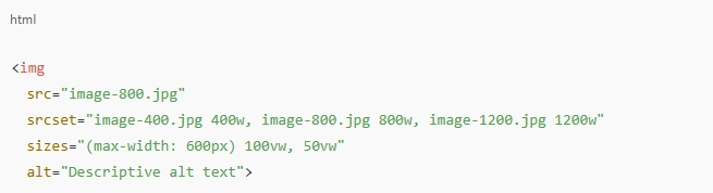
This prevents sending an oversized image to a small device or a tiny image to a large display. Also include high-DPI/retina versions (2x) if needed. If you’re working on a website redesign, resizing and optimizing images ensures your new web layout loads smoothly across all screen sizes.
5. Use lazy loading for below-the-fold images
Lazy loading defers image downloads until they are near the viewport. This reduces initial page weight and speeds up time-to-interactive.
Options:
- Native HTML attribute: <img loading=”lazy” src=”…”> — simple and widely supported.
- JavaScript lazy-loading libraries (for complex use cases or older browsers).
For background images, use Intersection Observer to load images when in view.
6. Optimize delivery with a CDN
A Content Delivery Network (CDN) stores copies of your images on edge servers close to users. Benefits include faster loads and reduced server strain.
Action: Use a CDN that supports on-the-fly image processing (resize/convert/compress) so you can serve optimized variants without storing every possible file
7. Prefer modern formats (WebP, AVIF) with fallbacks
Modern formats deliver smaller files. Serve them with graceful fallback for unsupported browsers:
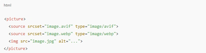
This ensures browsers that understand AVIF/WebP get the smaller file, others fall back to JPEG/PNG.
8. Use SVG for icons and simple graphics
SVGs are vector-based, scale perfectly, and often have tiny file sizes. Use them for logos, icons, and UI elements.
Tips:
- Keep SVG clean (remove metadata and unneeded attributes).
- Use viewBox appropriately, avoid inline styles if you prefer CSS control.
- For complex images, raster formats are still appropriate.
9. Implement caching and proper headers
Leverage browser caching so returning visitors don’t re-download unchanged images. Set HTTP cache headers (Cache-Control, ETag, Last-Modified) with long max-age for static assets and use cache-busting filenames (e.g., image.abc123.jpg) when files change.
Action: Configure your server or CDN to serve images with Cache-Control: public, max-age=31536000 and apply hashed filenames for updates.
10. Use placeholders and progressive loading for perceived performance
Perceived speed improves user experience. Techniques:
- Blur-up / LQIP (Low-Quality Image Placeholder): Show a tiny, blurred version first, then replace with the full image.
- Progressive JPEGs: Load a low-quality version quickly which progressively refines.
- Skeletons and placeholders: Keep layout stable while the image loads to reduce layout shift.
Implementation: Generate a tiny base64-encoded placeholder (10–20 px wide), include it inline, then swap when the main image loads.
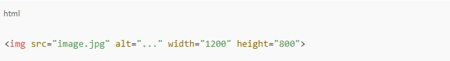
11. Prevent layout shift (avoid CLS problems)
Cumulative Layout Shift (CLS) harms UX and SEO. Fix by reserving space for images:
- Always include width and height attributes on <img> tags (or CSS aspect-ratio) to reserve the area.
- Use CSS aspect-ratio in modern browsers to preserve space before image loads.
12. Proper image naming and alt attributes for SEO & accessibility
File names and alt text help search engines and accessibility tools:
- Use descriptive, hyphenated filenames: red-running-shoes.jpg rather than IMG_1234.jpg.
- Write meaningful alt attributes that describe the image’s content. Keep them concise but informative.
- Avoid keyword stuffing. Use natural language.
This makes images discoverable and usable by screen readers.
13. Combine small images into sprites or use icon fonts
For many tiny icons, combine them into a single sprite (CSS background-position) or use SVG icon sprites / symbol system. This reduces HTTP requests. Modern approaches like inline SVG sprites or icon libraries (but optimized) work well too.
Caveat: Sprites are less relevant with HTTP/2 multiplexing and when using inline SVGs or icon components, but they still help in certain setups.
14. Automate optimization in build and upload pipelines
Make optimization part of your workflow:
- For static sites: integrate image optimization in build tools (webpack, Rollup, Gulp).
- For CMSs: use plugins that auto-compress/convert images on upload (WordPress plugins, for example).
- For large sites with user uploads: generate multiple sizes and compressed variants on upload.
Automation prevents human error and keeps your site consistently optimized.
15. Trim metadata and unnecessary color profiles
EXIF and metadata (camera info, geolocation) increase file size unnecessarily for web display. Strip metadata unless needed.
Tools: exiftool or image optimizers (many have options to remove metadata). Also convert images to standard sRGB color profile for consistent web colors; remove embedded ICC profiles if not required.
16. Optimize animated images: prefer video formats
Animated GIFs are heavy. Use modern alternatives:
- Animated WebP or APNG — lighter than GIF in many cases.
- MP4 / WebM — use for longer animations; often dramatically smaller and hardware-accelerated.
Use autoplay muted looped videos with playsinline for mobile compatibility, and provide poster images for fallback.
17. Audit, measure, and monitor (use tools and metrics)
You can’t improve what you don’t measure. Regularly audit image performance and check these metrics:
- Page weight: total KB/MB used by images.
- Largest Contentful Paint (LCP): often impacted by hero images.
- Time to First Byte (TTFB) and Time to Interactive.
- Number of requests: how many image requests are being made.
Use diagnostic tools: Lighthouse, PageSpeed Insights, WebPageTest, and browser devtools. Run audits after each major change and automate checks in CI where possible.
Tools & Services
You can choose free or paid tools depending on scale:
- Desktop apps: Squoosh (browser), Photoshop Export As.
- Command-line: imagemagick, mozjpeg, jpegoptim, pngquant, svgo.
- Build integrations: imagemin, sharp, gulp-imagemin, next/image for Next.js, gatsby-plugin-image for Gatsby.
- CMS plugins: WordPress image optimization and WebP conversion plugins (many popular ones exist).
- CDNs with image processing: CDNs that resize/convert at the edge save storage and bandwidth.
Choose solutions that fit your stack — for React/Next.js apps, use the framework’s image component for built-in optimizations; for WordPress, use plugins that integrate with CDNs or local optimization.
Common Pitfalls and How to Avoid Them
Over-compressing images: Don’t set quality too low; always visually check compressed results at typical screen sizes.
Serving WebP/AVIF without fallback: Some older browsers may not support them; always include a fallback JPEG/PNG.
Lazy-loading hero images: Don’t lazy-load critical images that appear above the fold.
Ignoring retina/HiDPI: Provide 2x assets or let srcset deliver higher density images to high-DPI displays.
Relying only on plugins without testing: Plugins can misconfigure or remove important headers. Test after changes.
Not versioning images: If images change but retain the same filename, caches will serve stale content. Use hashed filenames.
Testing and QA Checklist
- Verify image sizes sent in the network tab (DevTools).
- Confirm <img> has width/height or CSS aspect ratio to prevent CLS.
- Test on slow 3G throttled network to see perceived load improvements.
- Test on multiple devices and browsers, including retina displays.
- Confirm fallbacks work (disabled WebP via devtools to see JPEG served).
- Run Lighthouse and check LCP and overall performance scores.
Accessibility and SEO reminders
- Always include meaningful alt text. If an image is decorative only, use alt=”” so screen readers skip it.
- Use captions where helpful — captions can increase engagement and context.
- Consider structured data (schema) when images are key content (e.g., product images with Product schema).
- Ensure images don’t block content for assistive technologies.
When to Use Third-Party Image Optimization Services
Large sites, eCommerce platforms, or multi-regional sites often benefit from services that handle resizing, conversion, optimization, and CDN delivery automatically. They reduce engineering overhead and provide consistent results. Evaluate whether the cost and vendor lock-in are acceptable for your business.
Why Choose Mandy Web Design for Speed & Performance Optimization
Mandy Web Design is the best web design agency known for building high-performing, SEO-friendly, and visually engaging websites. We focus on delivering digital experiences that are not only beautiful but also fast, responsive designs, and optimized for every device.
Our team of top web designers combines design expertise with technical precision — ensuring your website’s structure, images, and user interface work together for maximum speed and performance. From using advanced compression techniques to implementing modern formats like WebP and AVIF, we make sure every site we build meets Google’s Core Web Vitals standards.
Whether you’re a startup or an established business, our goal is to create a seamless online experience that enhances your brand visibility and boosts engagement. With Mandy Web Design, your website won’t just look great — it’ll perform brilliantly too.
Is Your Website Loading Too Slow?
Don’t lose visitors to heavy images and poor performance. Get a free speed audit and discover how optimization can transform your site!
FAQs About Image Optimization
Image optimization is the process of reducing image file sizes without compromising quality to improve website speed and performance. It helps pages load faster, enhances user experience, and boosts SEO rankings. Optimized images also reduce bandwidth usage and improve Core Web Vitals scores.
Optimized images help search engines crawl pages faster, improve loading speed, and reduce bounce rates — all vital ranking factors. Properly named files, alt tags, and compressed images make your website more SEO-friendly and increase visibility in Google Image Search results.
The best image formats depend on use:
- JPEG/WebP/AVIF for photos and complex visuals.
- PNG for graphics or images needing transparency.
SVG for icons and logos.
Using modern formats like WebP and AVIF significantly reduces size while keeping quality intact.
You can compress images using tools like TinyPNG, Squoosh, or ImageOptim, which use smart algorithms to reduce file size while preserving visual quality. For automated workflows, use ShortPixel, Imagify, or Cloudflare Polish for real-time compression.
Lazy loading delays image loading until the user scrolls near them. This reduces initial page load time, saves bandwidth, and speeds up rendering of above-the-fold content. Simply adding loading=”lazy” to image tags is enough for most modern browsers.
Always use images sized according to where they appear on the page. Avoid uploading full-resolution photos when they’re displayed as thumbnails. Tools like Lighthouse, PageSpeed Insights, or browser dev tools can help identify images that are too large for their display size.
Use the HTML srcset and sizes attributes to serve different image sizes for various screens. This ensures mobile users download smaller files while desktop users get high-quality versions, improving both performance and user experience.
Top tools for 2025 include Squoosh, TinyPNG, ShortPixel, Kraken.io, Imagify, Cloudinary, and ImageKit. These platforms support compression, format conversion (WebP/AVIF), resizing, and CDN delivery — ideal for keeping your website fast and SEO-optimized.

About the Writer
Abhishek Thakur
Sr. Content Writer at Mandy Web Design
Abhishek Thakur is the Senior Content Writer at Mandy Web Design, where he crafts engaging content for the company’s website, blog, and marketing campaigns. With 5+ years of experience in digital marketing and SEO content creation, he specializes in turning complex topics into easy-to-understand, actionable strategies that help businesses grow online. He is passionate about creating high-quality, value-driven content that connects with audiences and builds brand authority. When he’s not writing, he enjoys exploring new ideas, learning the latest marketing trends, and improving his creative skills.